
 RSS Feed
|
On June 14th the FOMC decided to increase the Federal Funds Rate. This move was almost perfectly anticipated by the WSJ Economic Forecast Survey participants. However, a close look at their revisions to the future rates has them leaving the Fed funds rate mostly unchanged, but seeing significant declines in Ten-year bonds particularly in the short term. The graph below shows the changes in expected interest rates through the end of 2019. 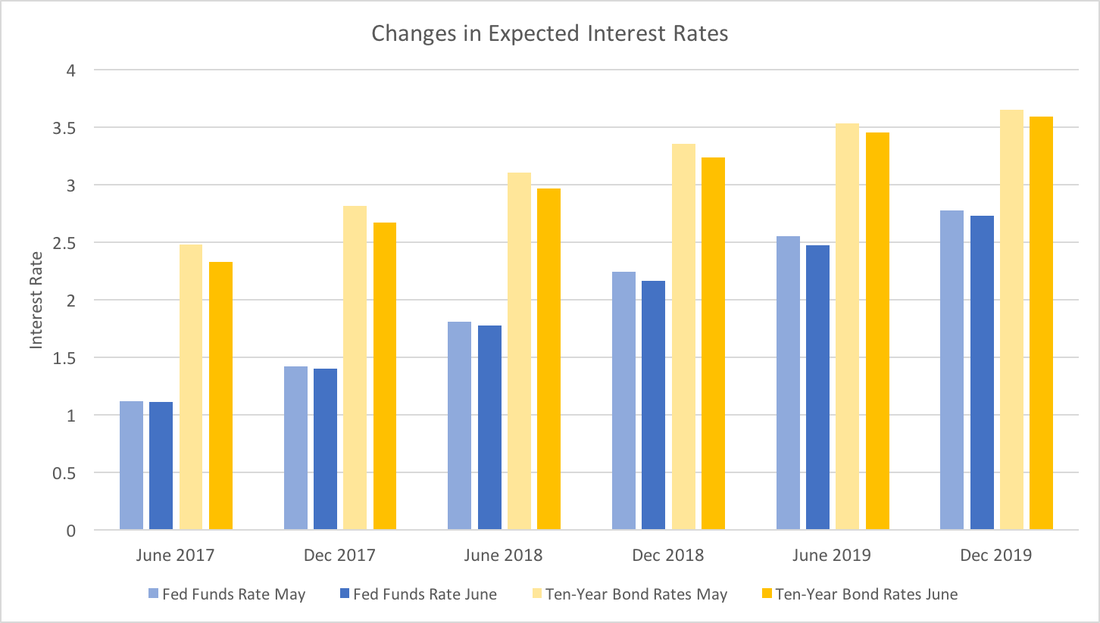 While June and December 2017 Federal funds rates forecasts are almost identical, the Ten-year Bond rates have dropped significantly. This could reflect greater certainty over Fed policy, and less perceived economic risk in the short-term. That is, the Fed has been effectively communicating their criteria for raising rates and participants forecasts have not seen a reason to change the projected path. Since the data have been, for the most part, positive, forecasters believe the bond markets will incorporate the lower economic risk into the bond rates. Taken as a whole, this suggests that expectations about the short-term future economy are good.
Turning to the longer-run (in 2019), both expected rates have dropped slightly. Given the long forecasting horizon it may only reflect reversion to the mean (what goes up must come down). However, I suspect that forecasters recognize that while the economic data has been positive, it has not signaled robust growth. Essentially, we are still (very slowly) climbing out of the hole the financial crisis created and we should continue to do so for the next two years or so.
0 Comments
Hillary Clinton stated in a recent interview that misogyny contributed to her loss in the 2016 election. No doubt that some voters cast votes based on gender (in both for and against Clinton), but those voters (and votes) decided long before the election season started. Many claim that Bernie Sanders and Donald Trump tapped into working class anger over inequality. However as Nate Silver has pointed out on numerous occasion (here and here just to mention a few), GDP growth has some explanatory power in predicting elections. Specifically, low or negative GDP growth tends to hurt the chances of the incumbent party. This post dissects the claims of inequality and headline economic growth. 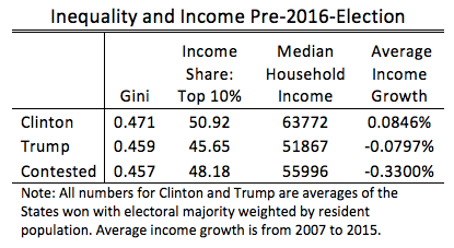 The table above provides statistics of states in which the majority of voters voted for Clinton or Trump and those states where neither received the majority. For inequality we have data on the Gini coefficient within each state in 2010 and the share of income commanded by the top 10 percent within each state in 2013. The Gini coefficient measures the degree of inequality on a scale from 0 (least unequal) to 1 (most unequal). Clearly by both measures, within-state inequality was worse for states that overwhelmingly voted for Clinton.
Hosehold median income arguably shows the inequality story as a national phenomenon, but those statistics were qualitatively the same at the time of Barack Obama's re-election in 2012. However, when we turn to the average growth rate of median household income over Obama's tenure (2007-2015) we see a striking disparity between the states where the majority voted for Clinton and the rest. The solid Clinton states fully recovered from the recession and have even surpassed pre-crisis income levels. In contrast, the solid Trump States have not. In the contested state, the "incumbent" democrats faced strong headwinds from the slow growing economy. What have we learned? Local inequality does not seem to be driving election results, however, the lack of economic recovery in states that either voted for Trump or were narrow contests surely influenced the election. A suggestion for future elections would be to consider the long-term economic growth within a state as opposed to the entire nation over the term of the incumbent. Notes: Gini data comes from the US Census Bureau. Income share data comes from Mark Frank. Household income data comes from the GeoFred database. The Wall Street Journal economic forecast for June has been released. The first post of the June series will take a more in-depth look at the GDP forecasts. Previous posts (see here and here) looked at how consistently participants annual forecasts matched their intermediate quarterly forecasts. Alternatively, we could consider the influence of those quarterly forecasts had on the annual forecasts using a basic regression. The table below explores what quarterly forecast information had the greatest impact on annual forecasts. The sample of 49 analysts provided growth rates for all quarters and full year in both May and June (see the end of the post for some technical details). 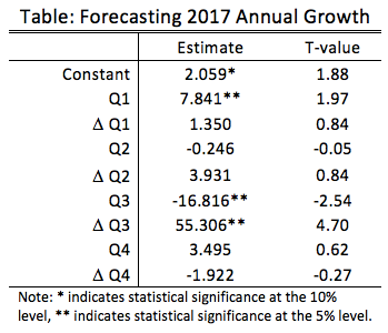 The results suggest that analysts with first quarter forecasts that were 1 percent above the mean tended to increase their annual growth forecasts by 7 hundredths of a percent more than the average. Basically those who are optimistic about the beginning of the year are optimistic for the whole year.
However, a more subtle result arises from the third quarter estimates and revisions. First, being optimistic about the level of third quarter growth was correlated with downward revisions of annual growth. Second, becoming more optimistic about third quarter growth was correlated with upward revisions of annual growth. A likely story that explains these facts is that revisions in third quarter growth are largely driving revisions in annual growth, but that those who are most optimistic about third quarter growth have somewhat muted expectations about annual growth. Forecasters project a 2.27 percent annual growth rate for the whole year and 1.20, 2.98, 2.57 and 2.47 percent for Q1, Q2, Q3 and Q4, respectively. Even though first quarter growth is still expected to be slow, forecasters anticipate that the subsequent quarters will be robust. The analysis above suggests that a critical component to changing expectations are optimism about third quarter growth and third quarter revisions. Technical Notes: The data for the levels are percent deviations from the mean. The data for the revisions are the percentage change from May to June. The regression utilizes standard Ordinary Least Squares, which means it does not account for endogeniety (quarterly and annual forecasts are created at the same time by the forecasters), therefore we cannot say anything about causality using this technique. Last July a little over 66 million passengers traveled via plane within the US up from a little less than 62 million in 2015. With the summer fast approaching, one might wonder if we will have another robust travel season. This post describes how the strong demand for air travel has been driven by a steady decline in ticket prices. 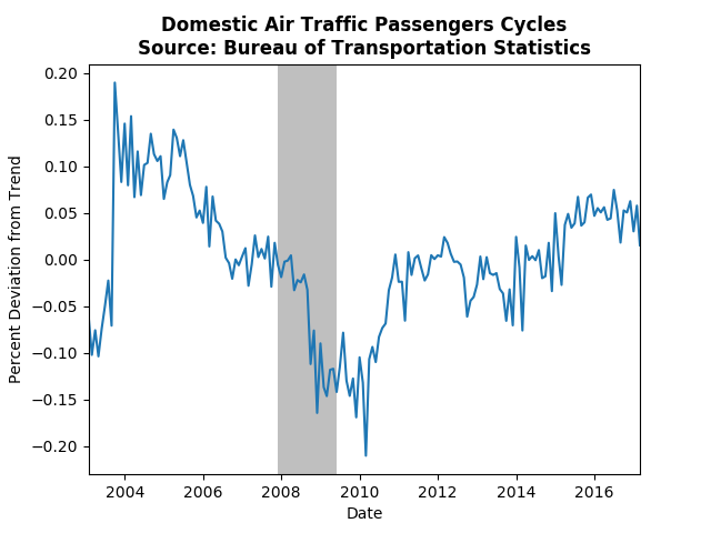 The graph above shows the cyclical component of the number of passengers on domestics flights in the US. (The graph including international flights is similar.) Not surprisingly the financial crisis depressed air travel, but the industry recovered well hovering around the trend from 2011 until late 2014. More recently, however, air traffic has hit a bit of a boom, driven, in most part, by a decline in ticket prices. 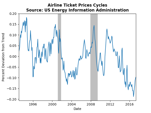 The graph above displays the cyclical component of tickets prices for domestic airline tickets. Since 2014 ticket prices have been consistently below trend, only recent showing signs of reversing course. This corresponds nicely to the above trend cycle in the number of passengers. Consumers are currently taking advantage of relatively low ticket prices, but the increased demand should increase pressure for a gradual increase in future ticket prices.
This post examines the WSJ Survey specifically looking at forecasts of the unemployment rate. Compared to previous posts on GDP, Fed Funds Rate, and Economic Risk, forecasters have high expectations for the future unemployment rate. In particular, they have become increasingly optimistic about 2018 relative to 2017. The graph below depicts the average forecasted unemployment rate for each month since December 2015 across June and December in 2017 and 2018. The lines become darker the closer the forecast is to the present. 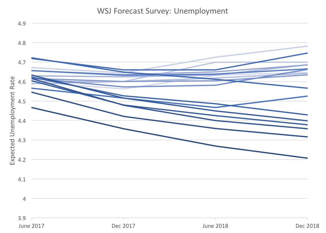 Forecasters are not just becoming optimistic about short-term unemployment, but they are also expecting the trend to continue for a year and a half. A year ago they were expecting the end of 2017 to be the low point in the unemployment rate. The current consensus forecast for December 2018 is 4.21 percent, a rate not seen since prior to the Dot Com bubble, however given the recent unemployment numbers (4.3%) this expectation seems plausible.
The upbeat unemployment forecasts put the more tepid GDP and interest rate forecasts in perspective. More than likely the most recent revisions are an overreaction to the strong April payroll employment numbers. The more recent May payroll and unemployment values send a more mixed message more consistent with previous GDP and interest rate forecasts. The Trump administration has plans to cut taxes. There have been other blogs and articles that have explained that tax cuts do not necessarily increase growth (see Dietrich Volrath, and Brookings for example). Most of these consider only US economic history, which may be idiosyncratic. Instead, this post will look at recent economic tax policy and economic performance of several OECD countries from 2000 to the present (the data can be found on stats.oecd.org). 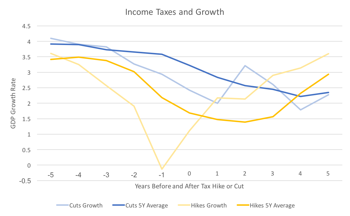 The graph above depicts the average growth rate before and after a tax policy change. The blue lines represent tax cuts and the yellow lines, tax hikes. The darker lines averages the five year average (annualized) growth rate within each country, and the lighter lines average the one year growth rate. The results confirm what has been found in most research, tax cuts have little impact on growth, and tax hikes can lead to higher growth in the long run.
The figure does a nice job of showing this, but numbers may also put it in perspective. The difference between the five year average before and after a tax cut is -0.877 percentage points. For a tax hike the similar number is 1.256 percentage points. In other words the five years after a tax cut have almost 1 percentage points lower GDP than the five years prior, whereas the years after a tax hike have a 1.25 percentage point increase. Some caveats to this analysis: 1) One might think that a tax cut follows the start of a recession. In this case 4 out of the 15 hikes and 9 of the 37 cuts occurred in 2008 through 2011. Roughly the same percent. 2) Deciding whether there was a tax hike or cut depended upon a change in the marginal income tax rates. Sometimes tax reforms changed both the margins and the rates, making it unclear whether there was a cut or a hike. Those cases were ignored. 3) Finally, the analysis above is crude and one dimensional. It is possible that countries that tend to cut taxes rather than raise them have other characteristics that lead to lower growth. Even with those caveats in mind, the evidence seems pretty clear. The lower tax rates will not be offset by higher economic growth, certainly not to the extent predicted by the administration or Congressional republicans. The WSJ economic forecasting survey asks for forecasts of ten-year bond rates. Used in conjunction with the Federal Funds Rate we can get a glimpse into whether market participants foresee the yield curve rising or falling over the coming years. A flatter yield curve can suggest two things, slower future economic growth or decreased economic risk. Two caveats to the analysis below: we only have two points on the yield curve and forecasts for bond rates exhibit a lot of variation. With those caveats in mind the graph below depicts the average spread between forecasted ten-year bond rates and the federal funds rate. As the spread gets smaller, the yield curve becomes less steep. Though there is a minor increase forecasted for the end of 2017 the overall trend remain downward. 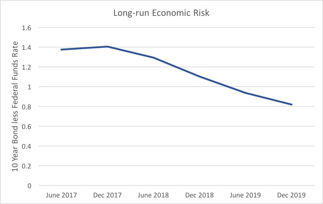 The flattening of the expected yield curve is mostly driven by increases in the Fed funds rate, which is expected to rise 1.66 percentage points from June 2017 to December 2019, whereas ten-year bonds are only expected to rise 1.11 percentage points over the same timeframe. Market participants do not expect the longer end of the yield curve to respond strongly to Fed action.
To reiterate one of the caveats above, while the average of these forecasters shows a definite trend, we see a fair amount of variability. Fifteen percent of participants who provided all forecasts for both ten-year bonds and the federal funds rate expect the yield curve to become more steep. Even though, the consensus clearly points to lower risk and slower future economic growth, that degree of variation provides enough uncertainty to warrant attention to changes in the expected yield curve. This post uses Shiller's historical data and Hamilton's method for extracting cycles to analyze three S&P aggregate indices: prices, earnings, and dividends. With these cycles one can assess when to form a portfolio comprised mostly of value, income or growth stocks. If a particular aggregate index approaches the peak in its cycle the strategy associated with it will no longer provide the best returns, and vice versa. The analysis below assesses which of the cycles is most favorable. 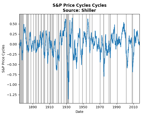 The graph above displays cycles over the monthly price index of the S&P. The current cycle has come off of its peak and appears right on its trend, which suggests growth investing may not provide the best strategy. Note that prior to the Great Depression the cycles almost perfectly coincide with recessions, whereas post Depression the relationship has broken down. Also note that the biggest negative spike occurred during the Depression. 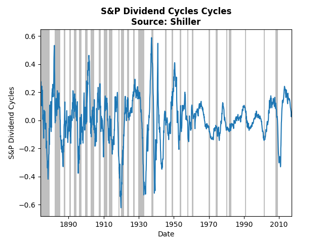 Dividend cycles, follow a somewhat similar pattern. Income investing also suffers from a cycle heading toward its trough. The lowest cycle occurred during the crash of 1920, the lesser known depression. 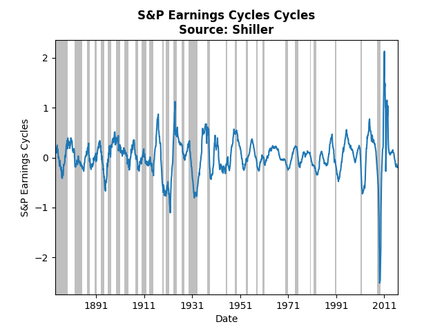 The graph above shows the same analysis of the S&P earnings index. Clearly the financial crisis had a huge impact on earnings, even relative to the Great Depression. The current cycle is slightly below trend and on par with many of the past troughs. Taken all together, the cycles imply that the best strategy at the moment is value investing. The cycles for prices and dividends do not appear to have hit their bottom, whereas earnings may soon pick up.
Today we take another look at the WSJ Economic Forecast Survey. This time we focus on non-farm payrolls. In some sense, non-farm payrolls provide a more accurate picture of the labor market than looking at headline unemployment. Typically we look at the change in non-farm payrolls. The graph below presents actual non-farm payrolls (in yellow) and the consensus forecast (in blue). 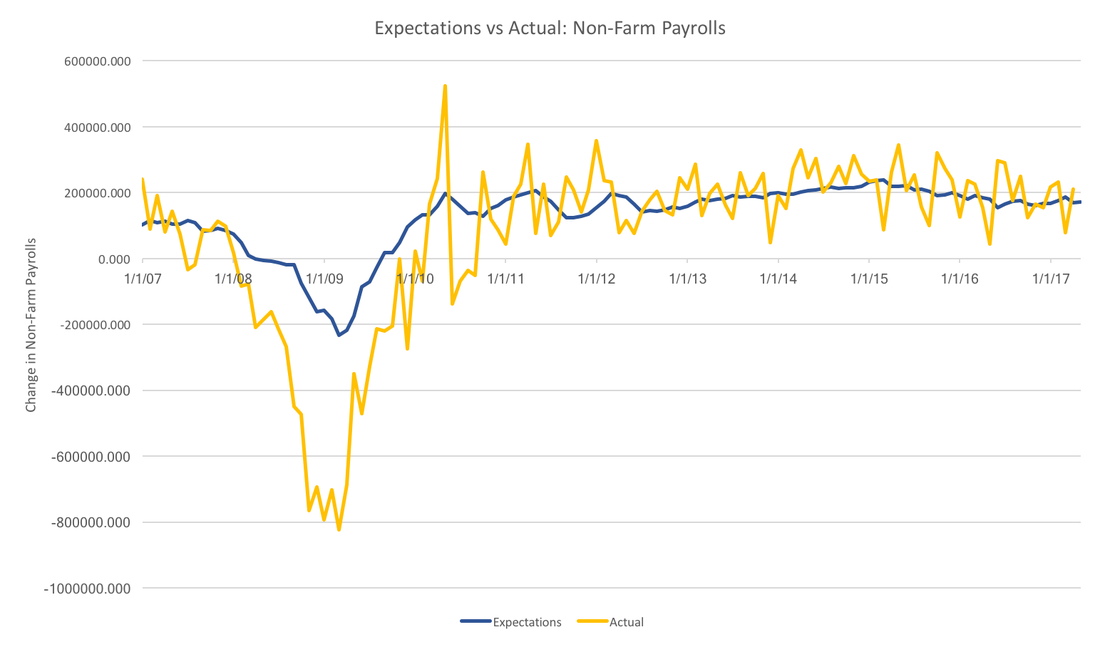 In general, the forecasters have been more or less on the trend over the past few years, however, they severely underestimated the Great Recession. In fact, the worst any individual thought job losses would be was 400,000, whereas job losses actually reached 750 thousand per month. While forecasters do seem to do well with the overall trend, they do not capture anything close to the month to month variation seen in the realized data.
Payrolls data suffer from major revisions. It is unclear whether forecasters are targeting initial estimates, or revised estimates, however, the picture above would be qualitatively unchanged. In the face of this much volatility it also makes sense for forecasters to focus on the trend rather than the noise. This strategy has served survey participants well, except for the recession. For now, it is unclear why forecasters were systematically over-optimitisic during the great recession. Using National Venture Capital Association Data we can see what has been going on in venture capital. The data the provide has four stages of development, and they provide both the total amount of money invested plus the number of projects funded at each stage. Using that and the consumer price index (the graph would be similar using another price index) we find the average inflation adjusted venture capital project in the graph below. 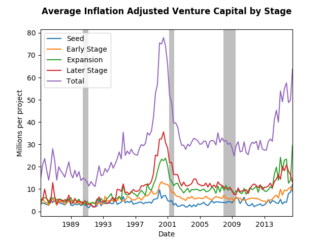 We can see the tech bubble very clearly, but the flat trend that followed might surprise you. It surprised me. The amount of seed money has more or less remains the same, but the later stage contributions from VC's have almost tripled since the late eighties. One can only assume that the tech moguls who earned their millions (nay billions) in the nineties appear to be giving back. In addition, the great recession was but a mere speed bump in the VC world at least in terms of amount spent per project. In fact, in terms of total number of project funded, the great recession had a major impact as the graph below depicts. 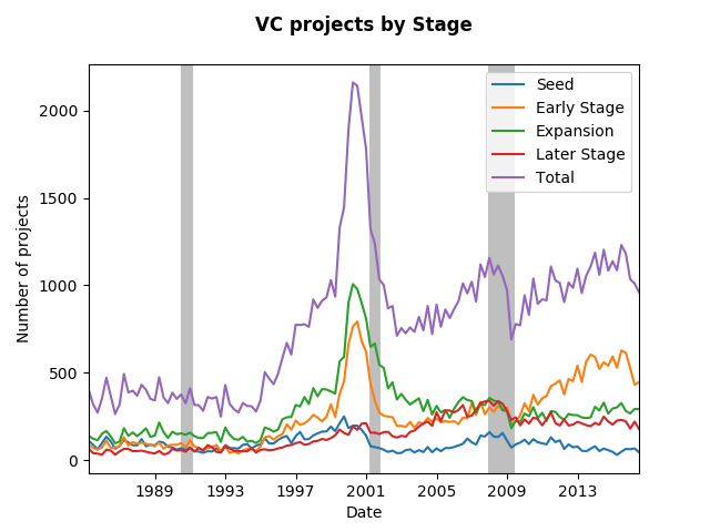 Note, that the number of Early Stage VC projects drive the recovery from the recession, however, all stages appear to increase in funding over the past few years. The expansion stage has not started ramping up like the previous bubble, therefore the recent changes in average funding rates reflect the strengthening economy.
|
Archives
May 2018
Categories
All
|