
 RSS Feed
|
In general, we observe WSJ forecasters responding to favorable economic data. Consensus GDP forecasts through Q4 of 2018 are all above 2.5 percent, with inflation just above 2 percent through the same time period. However, the longer range projections suggest an economic slow down approaching. Sticking to the good news: housing price and housing start expectations are up. In addition, consensus unemployment figures dropped yet again, with the expected consensus low occurring in the middle of 2019 at 3.8 percent. The recession probability dropped a full percentage point to 13 percent. Unfortunately, there are some more expected headwinds. Crude oil prices rose sharply in short run forecasts, with the June 2018 jumping almost 3 dollars to 58.55. The longer run forecasts of oil prices also rose, but by smaller amounts. However, the most concerning bit about current consensus expectations is the flattening of the yield curve. I have mentioned this several times in previous blog posts in my November and December updates. Here is a graph to illustrate the point with the newest data: 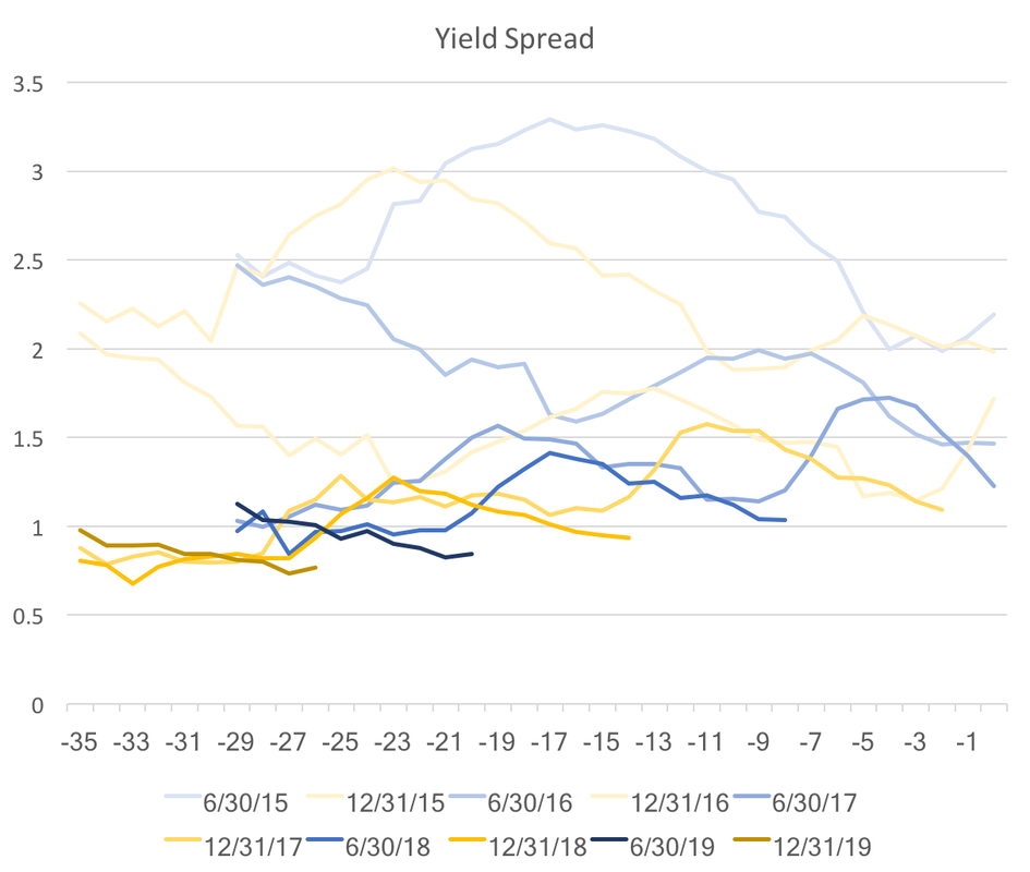 The graph above shows the difference between the consensus forecasts of the ten year bond rate and the federal funds rate. The color shade represents different future dates the darkest being the furthest in the future. We observe an abrupt jump down for the 2018 and 2019 spreads. A flatter yield curve has been cited as an indicator for a coming recession, and these forecasts suggest that tightening will happen over the next year or so.
The WSJ forecasters consensus is that 2018 should be a pretty strong economic year, but this expansion is heading towards its close as we move to 2019.
0 Comments
The WSJ economic forecasting survey asks for forecasts of ten-year bond rates. Used in conjunction with the Federal Funds Rate we can get a glimpse into whether market participants foresee the yield curve rising or falling over the coming years. A flatter yield curve can suggest two things, slower future economic growth or decreased economic risk. Two caveats to the analysis below: we only have two points on the yield curve and forecasts for bond rates exhibit a lot of variation. With those caveats in mind the graph below depicts the average spread between forecasted ten-year bond rates and the federal funds rate. As the spread gets smaller, the yield curve becomes less steep. Though there is a minor increase forecasted for the end of 2017 the overall trend remain downward. 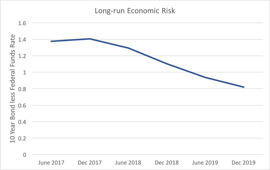 The flattening of the expected yield curve is mostly driven by increases in the Fed funds rate, which is expected to rise 1.66 percentage points from June 2017 to December 2019, whereas ten-year bonds are only expected to rise 1.11 percentage points over the same timeframe. Market participants do not expect the longer end of the yield curve to respond strongly to Fed action.
To reiterate one of the caveats above, while the average of these forecasters shows a definite trend, we see a fair amount of variability. Fifteen percent of participants who provided all forecasts for both ten-year bonds and the federal funds rate expect the yield curve to become more steep. Even though, the consensus clearly points to lower risk and slower future economic growth, that degree of variation provides enough uncertainty to warrant attention to changes in the expected yield curve. Another type of post, though one that will appear less frequently, will relate to my research. My recently published article with Arunima Sinha investigates Euro yield curves. We noticed that AAA Euro yields were far more stable during the financial crisis and subsequent debt crisis than those of lower credit ratings. Our paper highlighted the implications on how expectations might be formed across these two different risk pools. This was made possible because the ECB collects data on two categories of yield curves one with AAA Euro bonds and another with all-ratings Euro bonds. This post, however, addresses someting not brought up in the paper. Using these data on yields with varying risk, one can calculate a risk spread (subtracting AAA yields away from all-ratings yields). The larger the spread for a paticular maturity (say a 1Y bond) would indicate greater risk for defaults over that time horizon (1Y). In doing so, one can visualize the story of the financial crisis and European debt crisis. It can also shed some light on the current risks. (This data is freely available on the ECB's Statistical Data Warehouse.) Below is a 3D plot of that data from September 6, 2004 until May 5, 2017 on ten different maturities (3M, 6M, 1Y, 2Y, 3Y, 4Y, 5Y, 10Y, 20Y, 30Y). The heatmap shows at what point in time risks peak for the various maturities. For the first few years risks were negligible. Through the beginning of the financial crisis in the US, risks increased slightly, but tapered off mid-2009 leaving only the long-run spread (10Y and 20Y maturities) elevated. Throughout 2010 and 2011 the medium-run (2Y, 3Y, 4Y, and 5Y) and long-run (10Y, 20Y, and 30Y) spreads continually edged higher until November of 2011 where it peaked in the 1Y and 2Y maturities from the 25th to the 28th. This coincides with the hieght of the debt crisis. However, looking back we can see that the medium-run spreads were about the same or higher than the long-run spreads starting back in July and August. This suggests that market participants registered the danger fairly early on. 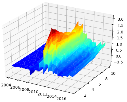 As a description of the debt crisis the AAA-all bonds spread provides a detailed map of how information influenced the debt risk. While spreads have not recovered to their pre-crisis levels they did recover significantly since 2011. They were almost fully recovered at the end of 2014 into 2015. However, recently, perhaps in response to continued pressure from populist candidates at the polls, spreads of started rising again. The levels we are seeing now in the medium-run are similar to those of mid-2010 and the long-run levels are similar to the end of 2010 beginning of 2011. It would not be prudent to consider this risk spread as an indicator of another impending debt crisis, but it does put into perspective the level of risk markets perceive in the relatively debt-ridden European countries.
|
Archives
May 2018
Categories
All
|