|
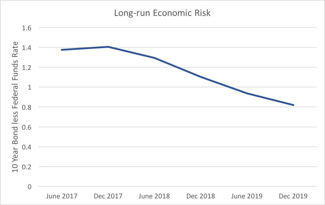
The WSJ economic forecasting survey asks for forecasts of ten-year bond rates. Used in conjunction with the Federal Funds Rate we can get a glimpse into whether market participants foresee the yield curve rising or falling over the coming years. A flatter yield curve can suggest two things, slower future economic growth or decreased economic risk. Two caveats to the analysis below: we only have two points on the yield curve and forecasts for bond rates exhibit a lot of variation. With those caveats in mind the graph below depicts the average spread between forecasted ten-year bond rates and the federal funds rate. As the spread gets smaller, the yield curve becomes less steep. Though there is a minor increase forecasted for the end of 2017 the overall trend remain downward. The flattening of the expected yield curve is mostly driven by increases in the Fed funds rate, which is expected to rise 1.66 percentage points from June 2017 to December 2019, whereas ten-year bonds are only expected to rise 1.11 percentage points over the same timeframe. Market participants do not expect the longer end of the yield curve to respond strongly to Fed action.
To reiterate one of the caveats above, while the average of these forecasters shows a definite trend, we see a fair amount of variability. Fifteen percent of participants who provided all forecasts for both ten-year bonds and the federal funds rate expect the yield curve to become more steep. Even though, the consensus clearly points to lower risk and slower future economic growth, that degree of variation provides enough uncertainty to warrant attention to changes in the expected yield curve.
1 Comment
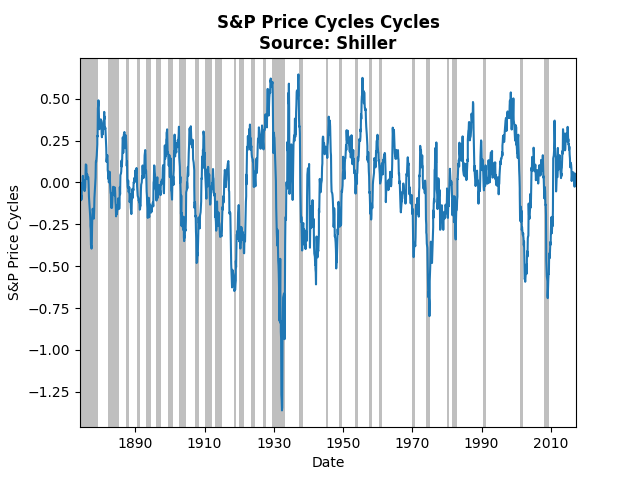
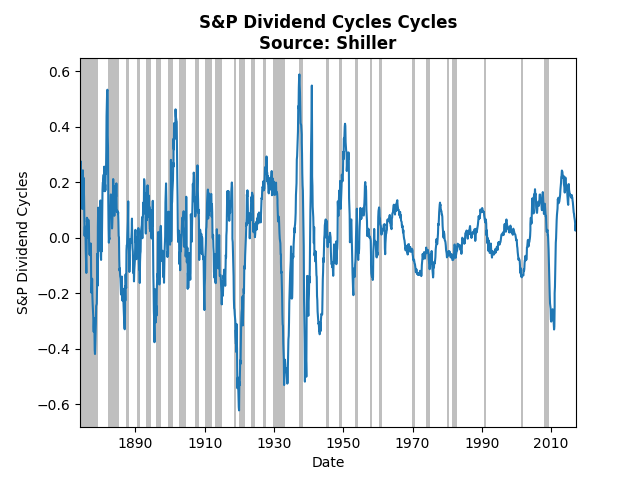
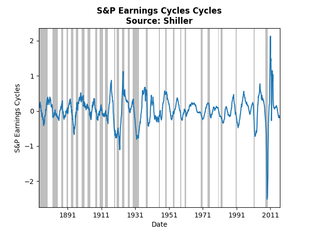
This post uses Shiller's historical data and Hamilton's method for extracting cycles to analyze three S&P aggregate indices: prices, earnings, and dividends. With these cycles one can assess when to form a portfolio comprised mostly of value, income or growth stocks. If a particular aggregate index approaches the peak in its cycle the strategy associated with it will no longer provide the best returns, and vice versa. The analysis below assesses which of the cycles is most favorable. The graph above displays cycles over the monthly price index of the S&P. The current cycle has come off of its peak and appears right on its trend, which suggests growth investing may not provide the best strategy. Note that prior to the Great Depression the cycles almost perfectly coincide with recessions, whereas post Depression the relationship has broken down. Also note that the biggest negative spike occurred during the Depression. Dividend cycles, follow a somewhat similar pattern. Income investing also suffers from a cycle heading toward its trough. The lowest cycle occurred during the crash of 1920, the lesser known depression. The graph above shows the same analysis of the S&P earnings index. Clearly the financial crisis had a huge impact on earnings, even relative to the Great Depression. The current cycle is slightly below trend and on par with many of the past troughs. Taken all together, the cycles imply that the best strategy at the moment is value investing. The cycles for prices and dividends do not appear to have hit their bottom, whereas earnings may soon pick up.
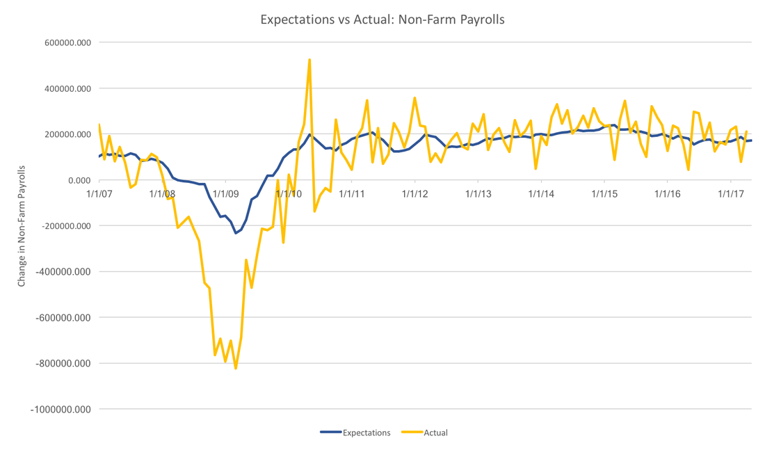
Today we take another look at the WSJ Economic Forecast Survey. This time we focus on non-farm payrolls. In some sense, non-farm payrolls provide a more accurate picture of the labor market than looking at headline unemployment. Typically we look at the change in non-farm payrolls. The graph below presents actual non-farm payrolls (in yellow) and the consensus forecast (in blue). In general, the forecasters have been more or less on the trend over the past few years, however, they severely underestimated the Great Recession. In fact, the worst any individual thought job losses would be was 400,000, whereas job losses actually reached 750 thousand per month. While forecasters do seem to do well with the overall trend, they do not capture anything close to the month to month variation seen in the realized data.
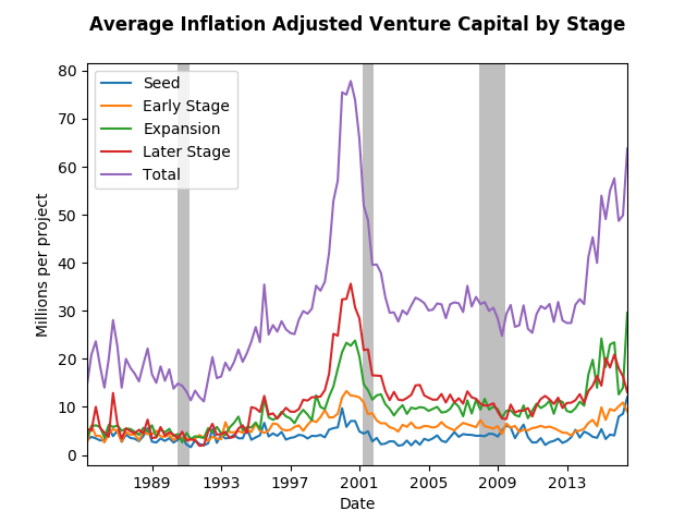
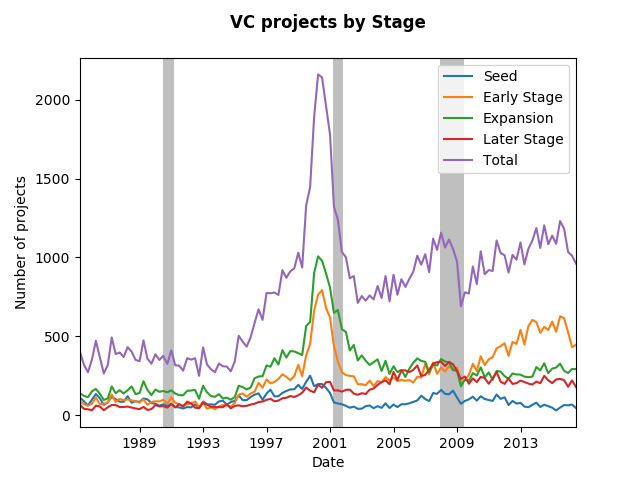
Payrolls data suffer from major revisions. It is unclear whether forecasters are targeting initial estimates, or revised estimates, however, the picture above would be qualitatively unchanged. In the face of this much volatility it also makes sense for forecasters to focus on the trend rather than the noise. This strategy has served survey participants well, except for the recession. For now, it is unclear why forecasters were systematically over-optimitisic during the great recession. Using National Venture Capital Association Data we can see what has been going on in venture capital. The data the provide has four stages of development, and they provide both the total amount of money invested plus the number of projects funded at each stage. Using that and the consumer price index (the graph would be similar using another price index) we find the average inflation adjusted venture capital project in the graph below. We can see the tech bubble very clearly, but the flat trend that followed might surprise you. It surprised me. The amount of seed money has more or less remains the same, but the later stage contributions from VC's have almost tripled since the late eighties. One can only assume that the tech moguls who earned their millions (nay billions) in the nineties appear to be giving back. In addition, the great recession was but a mere speed bump in the VC world at least in terms of amount spent per project. In fact, in terms of total number of project funded, the great recession had a major impact as the graph below depicts. Note, that the number of Early Stage VC projects drive the recovery from the recession, however, all stages appear to increase in funding over the past few years. The expansion stage has not started ramping up like the previous bubble, therefore the recent changes in average funding rates reflect the strengthening economy.
This post looks at the May WSJ Economic Forecasting Survey. Academic economists and seasoned professionals have found it notoriously difficult to forecast recessions. The survey asks panelists point blank about the probability of a recession in the coming 12 months. The consensus was 15 percent, about the same as the previous months. However, firms, governments, and individuals, may want to have a longer range forecast than the next year. To assess long-run forecasts we can turn to the analysts forecasts of the federal funds rate.
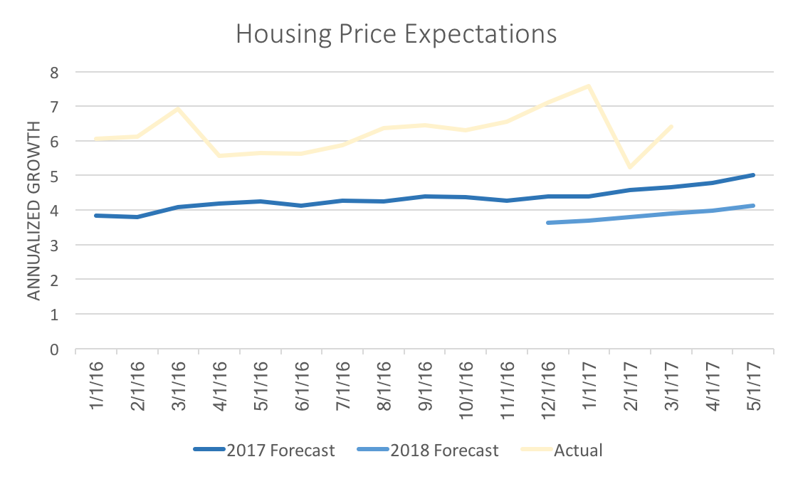
The federal funds rate is the interest rate at which commercial banks lend to one another overnight. By purchasing and selling assets (historical these were always government bonds, but the Fed has had more latitude to hold non-government securities and derivatives since the financial crisis), the Federal Reserve influences the market forces to acheive some interest rate target. Currently that target is between 0.75 and 1 percent (the daily actual interest rate tends to be 0.91 percent). The forecasting survey asks participants for a predicted Federal Funds rate every June and December through 2019. Instead of focusing on the values, we can draw insight from changes. For example, if a forecaster has a higher forecast for June 2018 then Decemeber 2017, then the implicit assumption is that the Fed percieves will still perceive strong economic growth. However, a lower forecast implies that the future Fed decision reflects weak economic growth. Until June 2019, 98 percent of survey participants foresee the Fed holding rates steady or increasing, suggesting continued economic expansion until then. That forecast is consistent with the low probability of recession predicted for the coming year. In December that percentage drops to 91, with only two analysts predicting a declining Fed Funds Rate. If the analysts predictions hold true, then the coming year or two promises to be strong. In addition, it is likely that the weak advance Q1 growth estimate of 2017, is either an aberration, or will be revised upward. In the short-run, 91 percent of analysts predict the Fed will increase rates by June 2017, as compared to 84 percent in April, and 60 percent in March. The strong employment numbers from April confirm that analysis. Continued positive news on other economic indicators will reinforce the likelihood of a rate hike in May or June. Liberty Street Economics just posted about their recent housing survey. They see a sharp increase in the housing price expectations by consumers. That local level survey reinforces the expectations of the WSJ forecasters. The graph below depicts the consensus expectations for housing price growth for the year of 2017. The light yellow line shows the actual annualized growth rates. Liberty Street shows changes of expectations from one year to the next, but with the WSJ forecasters we are able to observe a steady increase in estimates over the last 15 months. Predictions for 2018, while lower than 2017, also have become more optimistic. This is partial due to continued rapid growth of actual house prices. Again, the data above corroborates Liberty Street's story using different data (FHFA housing price index supplied by Freddie Mac vs the Case-Shiller index used by Liberty Street).
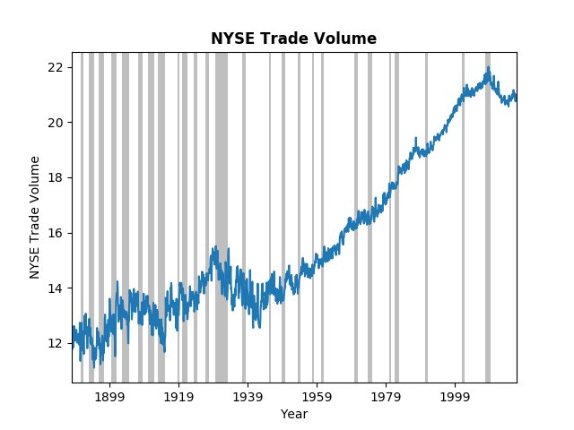
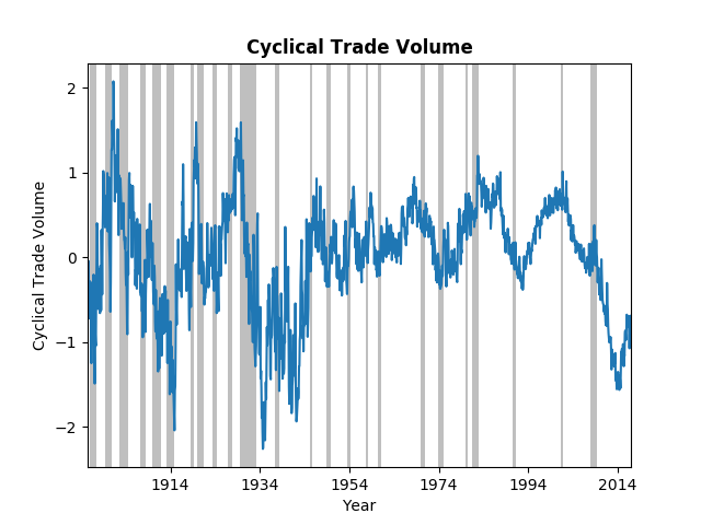
Housing price growth is expected to slow down, however, both consumers and financial professionals agree it will not slow down too much. The third type of post on this blog will consist of interesting data and/or empirical techniques. The world has become increasingly dependent on data and data analysis. Understanding what one can do with data and recognizing the vast array of potential data can improve both personal and professional decsion making. This particular post will highlight both an interesting data set, NYSE trade volume, and an emprical technique, a method proposed by James Hamilton for extracting cycles from time-series data. The New York Stock Exchange has a wonderful website that provides NYSE Group Daily Share volume all the way back to 1888! While this might not provide deep insight to a particular stock or industry, it does provide an overview of the general investment climate. The graph below displays the logarithm of trade volume, with NBER dated recessions in grey for reference. Even in logarithms, the growth in trade volume over almost 140 years is tremendous. It is clear from the figure that financial crisis had significant impact on overall trade volume. However, we might ask, Is this worse than previous down turns? or Have we climbed out of the hole yet? To answer those questions we turn to a paper/post from James Hamilton on the Hodrick-Prescott (HP) filter. Dr. Hamilton does a great job of explaining the HP filter, why you should not use it, and his proposed alternative. The graph below uses his alternative to extract the cycles from the trade volume data. Not surprisingly the most recent down-turn was dramatic, but on the same scale as the Great Depression and the after effects of the 1907 panic. For those of you interested in history, the Federal Reserve was created in response to the 1907 crash. It does appear that trade volume has begun to climb toward the long-run trend, but it still has a ways to go. One final note on this data; trade-volume has become more stable. The wild swings in the early 1900's have significantly decreased, in part, one might argue, due to the financial regulations put in place after the Great Depression.
Recently the WSJ made the May economic forecasts available on their website. In replicating the previous analysis it became clear that the results were influenced by the selected sample. The proper comparison, requires that all values are calculated using the same group of forecasters. The table below reanalyzes data of the 37 forecasters that provide forecasts for Q1, Q2, Q3, Q4, and the full year of 2017. It includes the May forecasts. Forecasters have become increasingly pessimistic about annual growth, while remaining more optimistic about individual quarters. Their predicted annual growth rates have fallen 0.186 percentage points, whereas growth rates calculated using a geometric average of predicted quarterly rates have fallen 0.126 percentage points. As a consequence, calculated annual growth went from being higher than reported annual growth to being lower.
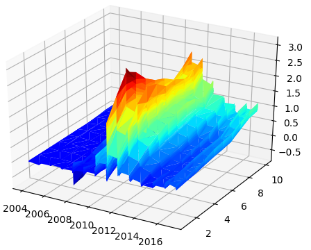
Solid predicted growth in Q2 outweighed the lackluster economic performance of the first quarter. The significant drop in the first quarter reflects the advanced estimate of GDP reported by the BEA in April. Another type of post, though one that will appear less frequently, will relate to my research. My recently published article with Arunima Sinha investigates Euro yield curves. We noticed that AAA Euro yields were far more stable during the financial crisis and subsequent debt crisis than those of lower credit ratings. Our paper highlighted the implications on how expectations might be formed across these two different risk pools. This was made possible because the ECB collects data on two categories of yield curves one with AAA Euro bonds and another with all-ratings Euro bonds. This post, however, addresses someting not brought up in the paper. Using these data on yields with varying risk, one can calculate a risk spread (subtracting AAA yields away from all-ratings yields). The larger the spread for a paticular maturity (say a 1Y bond) would indicate greater risk for defaults over that time horizon (1Y). In doing so, one can visualize the story of the financial crisis and European debt crisis. It can also shed some light on the current risks. (This data is freely available on the ECB's Statistical Data Warehouse.) Below is a 3D plot of that data from September 6, 2004 until May 5, 2017 on ten different maturities (3M, 6M, 1Y, 2Y, 3Y, 4Y, 5Y, 10Y, 20Y, 30Y). The heatmap shows at what point in time risks peak for the various maturities. For the first few years risks were negligible. Through the beginning of the financial crisis in the US, risks increased slightly, but tapered off mid-2009 leaving only the long-run spread (10Y and 20Y maturities) elevated. Throughout 2010 and 2011 the medium-run (2Y, 3Y, 4Y, and 5Y) and long-run (10Y, 20Y, and 30Y) spreads continually edged higher until November of 2011 where it peaked in the 1Y and 2Y maturities from the 25th to the 28th. This coincides with the hieght of the debt crisis. However, looking back we can see that the medium-run spreads were about the same or higher than the long-run spreads starting back in July and August. This suggests that market participants registered the danger fairly early on. As a description of the debt crisis the AAA-all bonds spread provides a detailed map of how information influenced the debt risk. While spreads have not recovered to their pre-crisis levels they did recover significantly since 2011. They were almost fully recovered at the end of 2014 into 2015. However, recently, perhaps in response to continued pressure from populist candidates at the polls, spreads of started rising again. The levels we are seeing now in the medium-run are similar to those of mid-2010 and the long-run levels are similar to the end of 2010 beginning of 2011. It would not be prudent to consider this risk spread as an indicator of another impending debt crisis, but it does put into perspective the level of risk markets perceive in the relatively debt-ridden European countries.
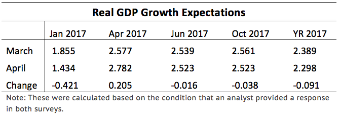
This innaugural post on the Wall Street Journal's Economic Forecasting Survey focuses on GDP forecasts. Future posts will examine other forecasted variables and discuss the major factors influencing those forecasts. The monthly survey asks over 50 financial and economic analysts for forecasts of multiple variables over multiple forecasting horizons. Forecasters are asked to provide estimates of Real GDP growth for the upcoming 4-5 quarters and 3-4 years. Since initial announcements of GDP are estimates the survey asks about quarters that have already passed. For example, in the April 2017 survey analysts were asked to offer expectations about first quarter GDP. The official "advance" estimate was announced by the BEA on April 28. This date is after forecasters submitted their forecasts to the WSJ. The advance estimate from the BEA came in at 0.7 percent, well below the forecasters consensus estimate of 1.4 percent. Forecasters may not be far off the actual numbers which will be anounced in several months. In general, the advanced numbers are revised by about half a percentage point (on average), which means the analysts were within a reasonable margin of error (the standard deviation for their forecasts was 0.48). What may be more revealing is digging into the revisions that the analysts themselves make from month to month. Below is a table of the consensus estimates and their change from March and April for all four quarters of 2017, as well as the annual growth for all of 2017. We see that the analysts made downward revisions (not one analyst increased their projection) of Q1 GDP, but increased Q2 GDP. The net effect was a slight drop in projected annual GDP growth. While the March and April numbers appear unchanged, they also fell slightly, but not enough to significantly impact annual growth.
That cohesive story breaks down a bit when one calculates the implied annual growth given by the quraterly growth rates. The consensus growth for 2017 in March was 2.37 percent while in April it increased to 2.53 percent for an average change of 0.151 percentage points. This suggests that analysts form forecasts over different time scales independently. That is, the forecast they make about annual GDP uses different information than the forecasts of each quarter leading to that total annual GDP. One way to interpret that is that the analysts see downside risk over the entire year of 2017, but are unsure in which quarter the shock will hit. Based on these forecasting revisions it seems that the most uncertainty resides in the second half of the year. |
Archives
May 2018
Categories
All
|

 RSS Feed
