
 RSS Feed
|
In preparing to teach Econometrics this Fall, I found very few online or textbook sources that visually explain what happens in a regression. This post attempts to just that using Galton's height data. This data comes from the paper that provided the world with the term regression. An econometrician might use this data to answer whether a father's height influences the height of his offspring. (The analysis below could just as easily be applied to the mother's height) I would like to illustrate what happens in a regression using simple scatter plots. This first graph shows the data sorted by height, which is centered around 66.7 inches. 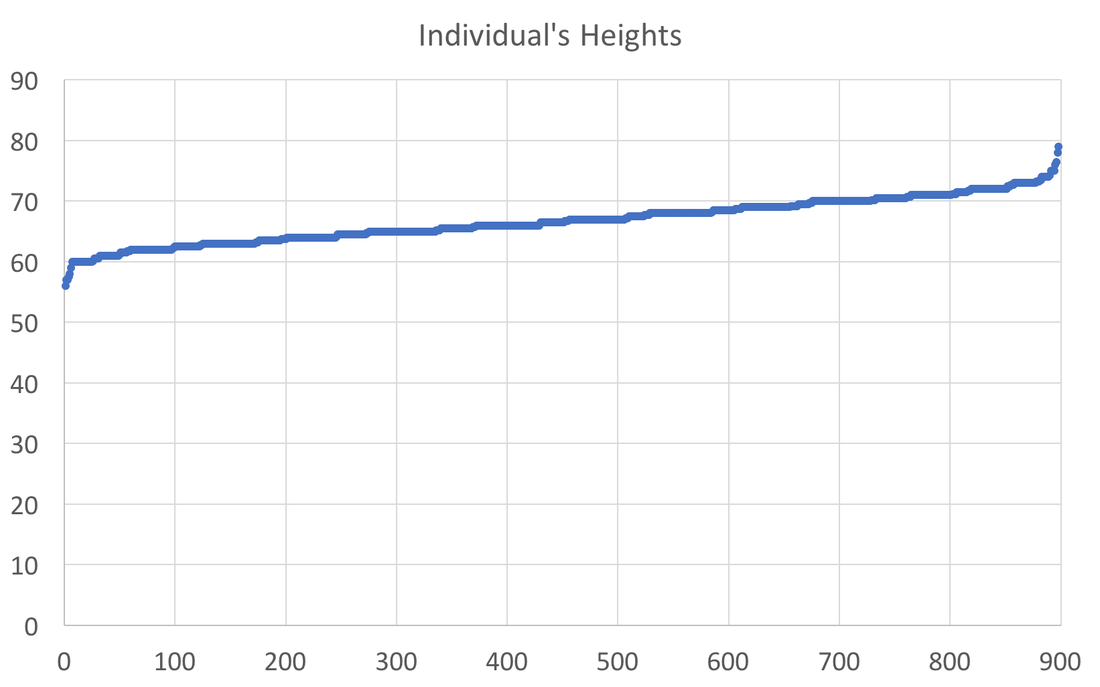 A regression attempts to find statistical relationships between variables (like height). One way to think about this is putting the data into different bins to see whether there are any differences. The most obvious bins that jump to mind when thinking about height is gender. The graph below first sorts by gender and then by heights: 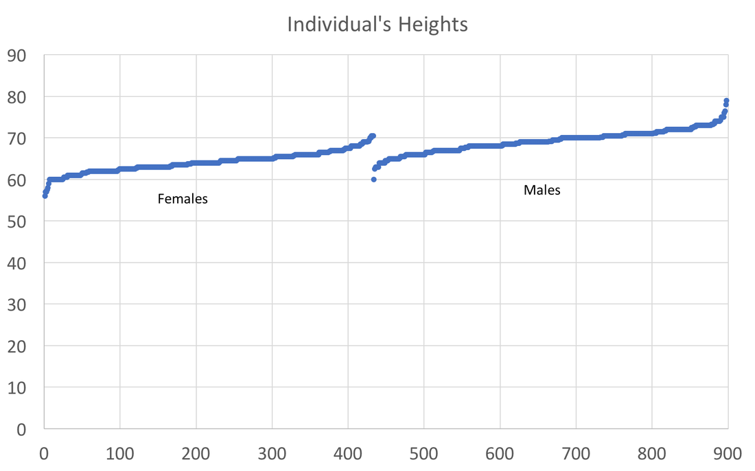 There is a clear difference between male and female heights. Almost half of the male height observations are above the tallest female observation. This should not be surprising, however it does provide the basic insight to how regressions work. The question a regression asks is, "if I observe someone to be a Female, what is their height?" The degree of statistical significance describes how distinct the bins are from one another. That is, the majority of the female observations are below the majority of the male observations. (the average for the women is 64.1 and 69.2) Now take that basic idea of bins to something like the fathers height. First sort the data in a similar manner, tall vs short fathers (cutoff being 70 in.). 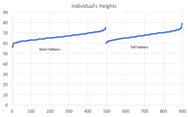 Here we see a very similar story, but not as stark as the difference between male's and female's heights. That means that the statistical significance of father's height is weaker, because we know that a person with a tall father should on average be taller, but additional variation still exists within these bins. If I increase the refinement of the filter to three bins we can find a break down like this: 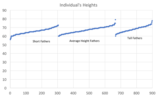 Keep going in this way and we can increase the number of "bins" to include each reported height. This makes a graph that has many bins: 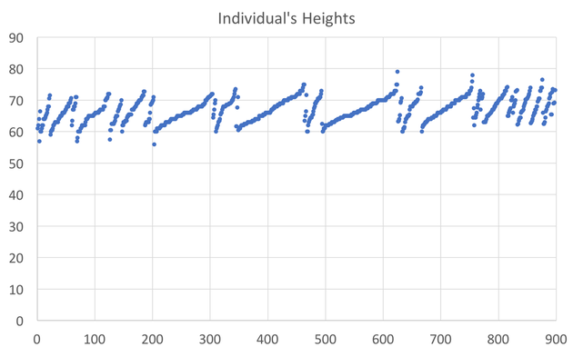 We can still see the general trend, taller fathers produce taller offspring, however there is a fair amount of variation within the different height bins, so much so that we cannot be very confident about how much paternal height influences offspring height. Instead, let's look at the classic visualization of regression, the line of best fit: 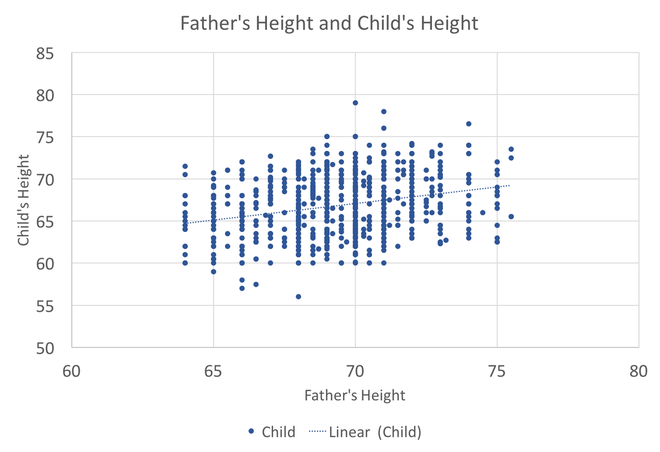 At first glance, our question has been answered; a father's height has a marginal influence their offspring. The underlying statistics will tell us that we can only explain 6% of the variation and that a father who could magically be one inch taller would produce offspring approximately 0.389 inches taller. However, we've forgotten the knowledge we gained about the great differences between male and female heights. The graph below visualizes the impact of how father's height influences a child's height conditional on whether that child is male or female. 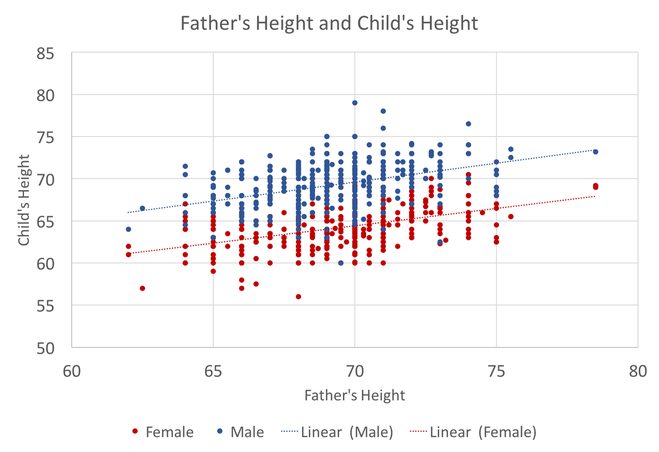 We can see a clear distinction between the males and females. In addition, we are able to explain much more of the variation (approximately 20%) and the influence of a father's height has increased to 0.43 inches per inch. The increase itself is not that important, however the confidence with which we can make that claim has increased (which is related to increase in explanatory power).
This illustrates the science and art of regression analysis. The technique looks for order between observations that exhibit variation. The art comes from understanding when (and what) it is appropriate to include or exclude from a regression. In this case, including an additional variable (gender) helped explain the variation and gave a better answer to our original question.
0 Comments
|
Archives
May 2018
Categories
All
|