RSS Feed
|
There is a lot of talk about bubbles in the stock market. Robert Shiller used to think there was a bubble, and continues to believe the market correction is coming soon. Paul Krugman is less sanguine, attributing the stock market boom to a global phenomenon and foreseeing economic strength in the future. Given his exhaustive analysis of the Great Recession and the aftermath, I would not expect him to miss an opportunity to warn about another bubble bursting. I more or less agree with Krugman, and I think market participants agree too. Take a look at the dramatic increase in margin debt relative to credit balances in margin accounts in the NYSE: 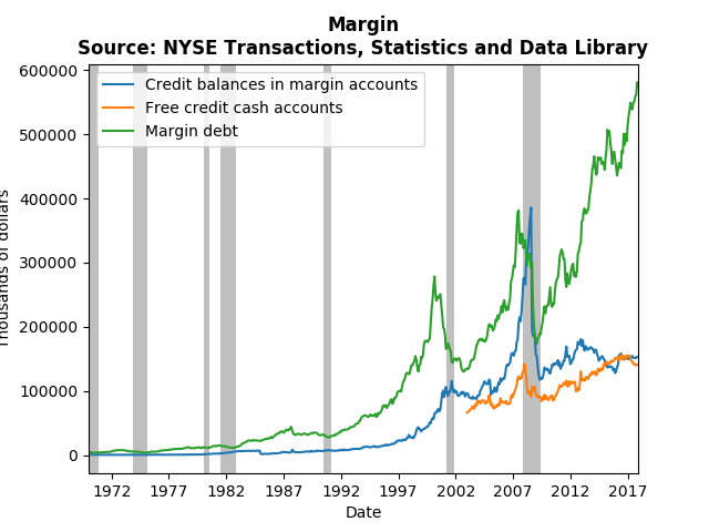 Clearly, the greatest risk takers (those trading on margins) are holding lots of long positions, while keeping short positions more or less constant. There has been a build up of credit in cash accounts, but it seems to be following the general upward trends of stock market participation. What I would be interested to know is whether the additional margin debt is due to new participants trading, or seasoned participants foreseeing long-term growth. If it is new participants, then there almost surely is a bubble. However, seasoned professionals would presumably be taking more short positions if the expected a coming crash. Should global stocks tank in the near future, it should be a big surprise.
1 Comment
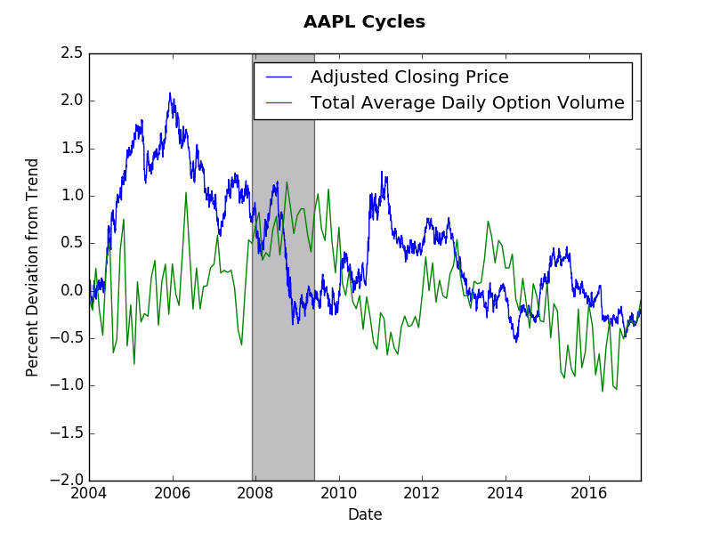
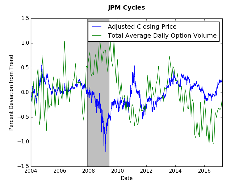
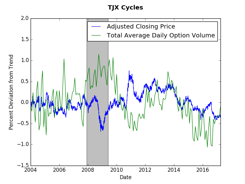
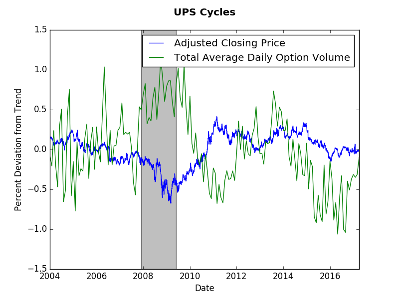
The short answer? No. The long answer will probably need to wait for a detailed academic paper. However, this post will present some suggestive evidence that the short answer above is correct. We will look at end of day price data (obtained via wiki EOD) and monthly options volume data (obtained from the CBOE). As usual, the Hamilton cycle method provides my preferred measure. This post shows that options volume tend to have longer cycles than stock prices. Our evidence will come from four stocks: Apple (AAPL), JP Morgan (JPM), TJ Maxx (TJX), and UPS. As you observe the graphs consider a cycle to be several months away from trend (zero). The graphs below present those cycles. Options and stock price do not appear to exhibit any synchronicity. Options cycles seem the same across these stocks despite them coming from different sectors of the economy. The only consistent fact is increased options volume and a decrease in stock price during the Great Recession. Options volume appears more jagged, which makes it harder to assess the cycles. However, if we were to look at stock volume we would find even more volatility.
To answer the question at hand let us just count the number of deviations from trend for each company. For Apple, 5 option cycles and 6 price cycles. For JP Morgan, 5 option cycles and 7 price cycles. for TJ Maxx, 5-6 option cycles and 7-8 price cycles. Finally, for UPS, 5 option cycles and 5 price cycles. This by no means is a statistical test, however, it does suggest that over the same time period there were fewer options cycles than price cycles. One can think of the option cycle as the force of speculation on the future stock price, whereas the current stock price cycle reflects more frequent news about firm value. Perhaps the lack of options trades (relative to stock trades) slows down the formal speculative market. When this post idea came to me, I expected a stronger correlation between prices and options. The lack of correlation true (more or less) when comparing stock volumes (the graphs were messier though). Any thoughts? Please comment below... If you would like to have a similar graph of a specific company let me know. This post uses Shiller's historical data and Hamilton's method for extracting cycles to analyze three S&P aggregate indices: prices, earnings, and dividends. With these cycles one can assess when to form a portfolio comprised mostly of value, income or growth stocks. If a particular aggregate index approaches the peak in its cycle the strategy associated with it will no longer provide the best returns, and vice versa. The analysis below assesses which of the cycles is most favorable. 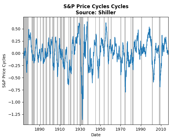 The graph above displays cycles over the monthly price index of the S&P. The current cycle has come off of its peak and appears right on its trend, which suggests growth investing may not provide the best strategy. Note that prior to the Great Depression the cycles almost perfectly coincide with recessions, whereas post Depression the relationship has broken down. Also note that the biggest negative spike occurred during the Depression. 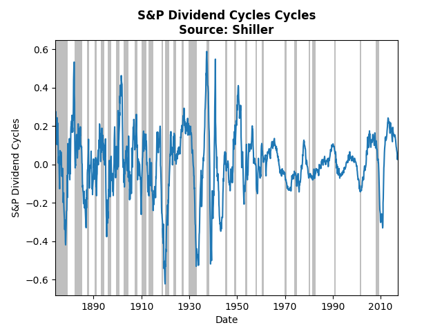 Dividend cycles, follow a somewhat similar pattern. Income investing also suffers from a cycle heading toward its trough. The lowest cycle occurred during the crash of 1920, the lesser known depression. 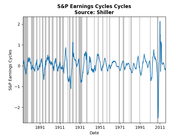 The graph above shows the same analysis of the S&P earnings index. Clearly the financial crisis had a huge impact on earnings, even relative to the Great Depression. The current cycle is slightly below trend and on par with many of the past troughs. Taken all together, the cycles imply that the best strategy at the moment is value investing. The cycles for prices and dividends do not appear to have hit their bottom, whereas earnings may soon pick up.
The third type of post on this blog will consist of interesting data and/or empirical techniques. The world has become increasingly dependent on data and data analysis. Understanding what one can do with data and recognizing the vast array of potential data can improve both personal and professional decsion making. This particular post will highlight both an interesting data set, NYSE trade volume, and an emprical technique, a method proposed by James Hamilton for extracting cycles from time-series data. The New York Stock Exchange has a wonderful website that provides NYSE Group Daily Share volume all the way back to 1888! While this might not provide deep insight to a particular stock or industry, it does provide an overview of the general investment climate. The graph below displays the logarithm of trade volume, with NBER dated recessions in grey for reference. Even in logarithms, the growth in trade volume over almost 140 years is tremendous. 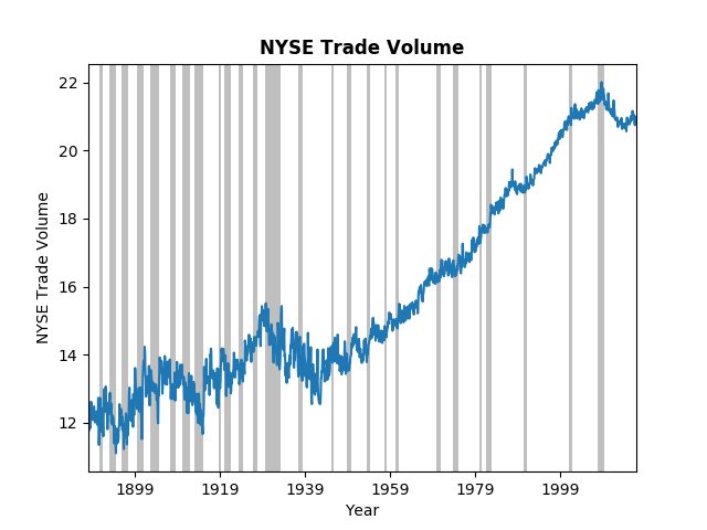 It is clear from the figure that financial crisis had significant impact on overall trade volume. However, we might ask, Is this worse than previous down turns? or Have we climbed out of the hole yet? To answer those questions we turn to a paper/post from James Hamilton on the Hodrick-Prescott (HP) filter. Dr. Hamilton does a great job of explaining the HP filter, why you should not use it, and his proposed alternative. The graph below uses his alternative to extract the cycles from the trade volume data. 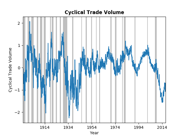 Not surprisingly the most recent down-turn was dramatic, but on the same scale as the Great Depression and the after effects of the 1907 panic. For those of you interested in history, the Federal Reserve was created in response to the 1907 crash. It does appear that trade volume has begun to climb toward the long-run trend, but it still has a ways to go. One final note on this data; trade-volume has become more stable. The wild swings in the early 1900's have significantly decreased, in part, one might argue, due to the financial regulations put in place after the Great Depression.
|
Archives
May 2018
Categories
All
|