RSS Feed
|
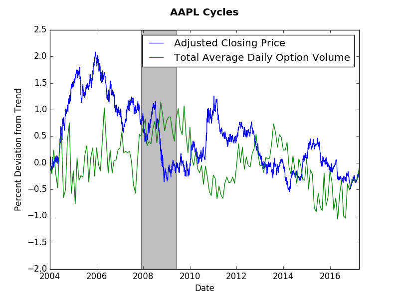
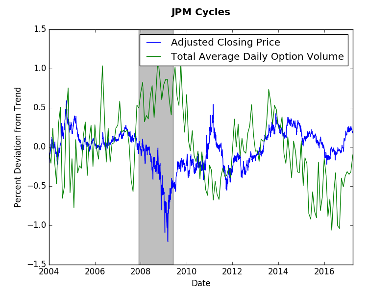
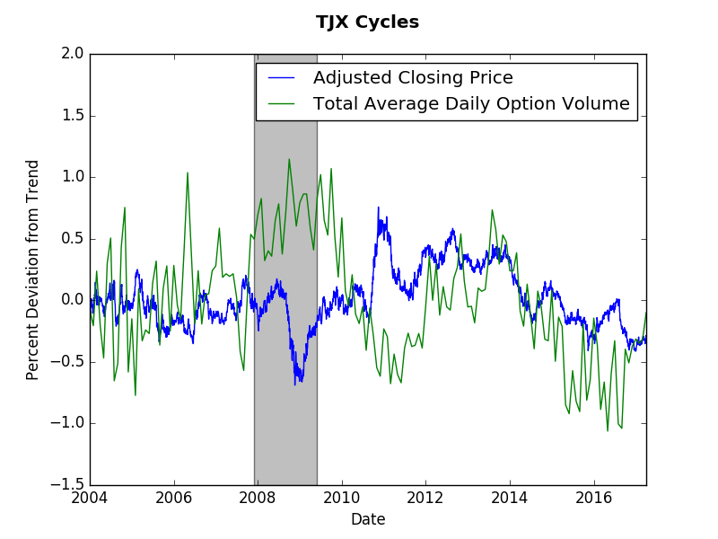
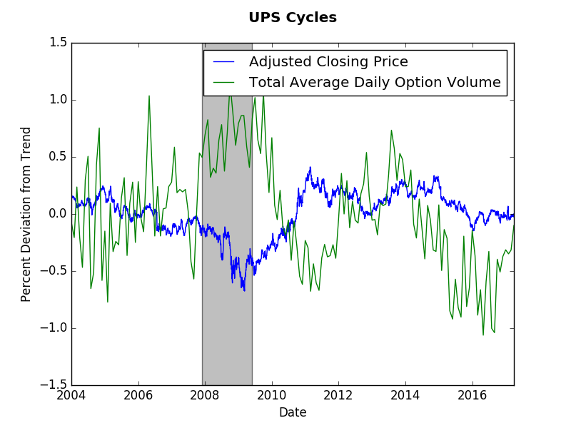
The short answer? No. The long answer will probably need to wait for a detailed academic paper. However, this post will present some suggestive evidence that the short answer above is correct. We will look at end of day price data (obtained via wiki EOD) and monthly options volume data (obtained from the CBOE). As usual, the Hamilton cycle method provides my preferred measure. This post shows that options volume tend to have longer cycles than stock prices. Our evidence will come from four stocks: Apple (AAPL), JP Morgan (JPM), TJ Maxx (TJX), and UPS. As you observe the graphs consider a cycle to be several months away from trend (zero). The graphs below present those cycles. Options and stock price do not appear to exhibit any synchronicity. Options cycles seem the same across these stocks despite them coming from different sectors of the economy. The only consistent fact is increased options volume and a decrease in stock price during the Great Recession. Options volume appears more jagged, which makes it harder to assess the cycles. However, if we were to look at stock volume we would find even more volatility.
To answer the question at hand let us just count the number of deviations from trend for each company. For Apple, 5 option cycles and 6 price cycles. For JP Morgan, 5 option cycles and 7 price cycles. for TJ Maxx, 5-6 option cycles and 7-8 price cycles. Finally, for UPS, 5 option cycles and 5 price cycles. This by no means is a statistical test, however, it does suggest that over the same time period there were fewer options cycles than price cycles. One can think of the option cycle as the force of speculation on the future stock price, whereas the current stock price cycle reflects more frequent news about firm value. Perhaps the lack of options trades (relative to stock trades) slows down the formal speculative market. When this post idea came to me, I expected a stronger correlation between prices and options. The lack of correlation true (more or less) when comparing stock volumes (the graphs were messier though). Any thoughts? Please comment below... If you would like to have a similar graph of a specific company let me know.
0 Comments
|
Archives
May 2018
Categories
All
|