|
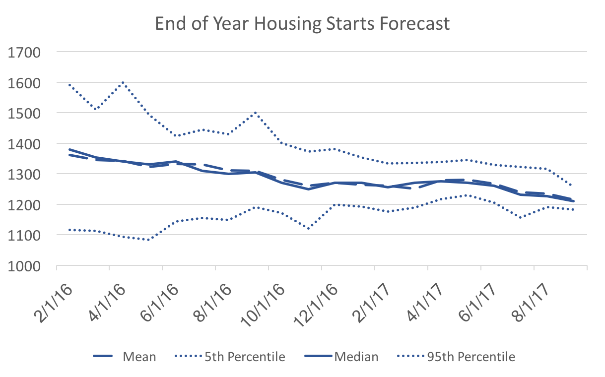
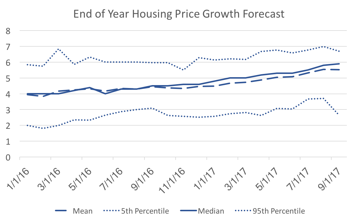
The WSJ Economic forecasters report on two housing market indicators: FHFA housing price index growth, and housing starts. Admittedly I do not spend a lot of time forecasting housing, but the following graph makes sense to me: Over time forecasters are reaching a consensus of the likely value of housing starts in December. It is a little lower than the mean and median at the beginning of 2016, but still easily within the range of forecasts at that time. The economy in general has not been as robust as people thought it might be (a strong recovery has never materialized), and so the decline in consensus is consistent. However, the following graph confuses me: We do not see a similar convergence to the mean, and instead we observe the forecast becoming more skewed over time (lots of high forecasts a few very low forecasts). We are only three months away from the realization and there is the same spread between the 5th and 95th percentiles as 21 months ago. What would cause some of the forecasters to hold such low housing price growth expectations relative to their peers? The only thing I can think is that those few outliers must anticipate an immediate and steep decline in housing prices.
On another note: I wonder if the change in forecast averages (higher prices and lower quantities) might indicate the the supply-side factors (production/construction) dominating the housing market. That is productivity is lower than forecasters expected. Whether that is low enough to signal a coming recession is not clear, but I keep looking at this forecast data with a fair amount of pessimism.
0 Comments
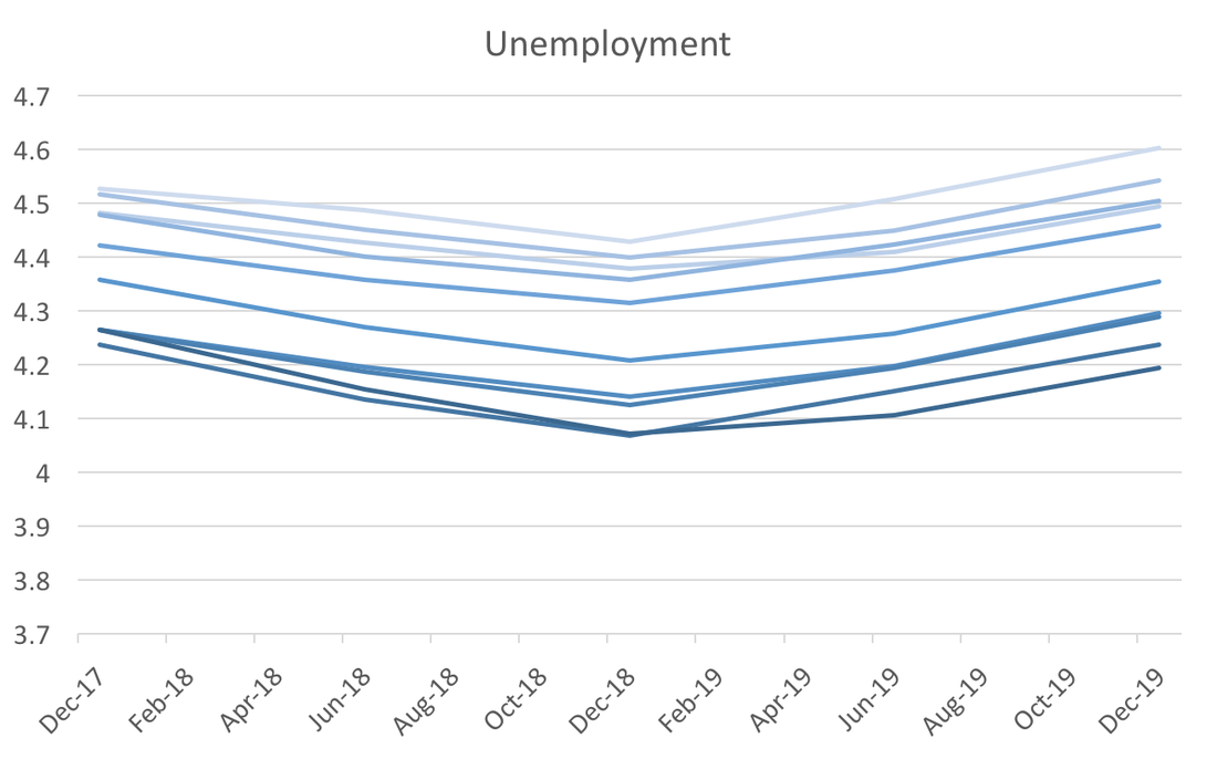
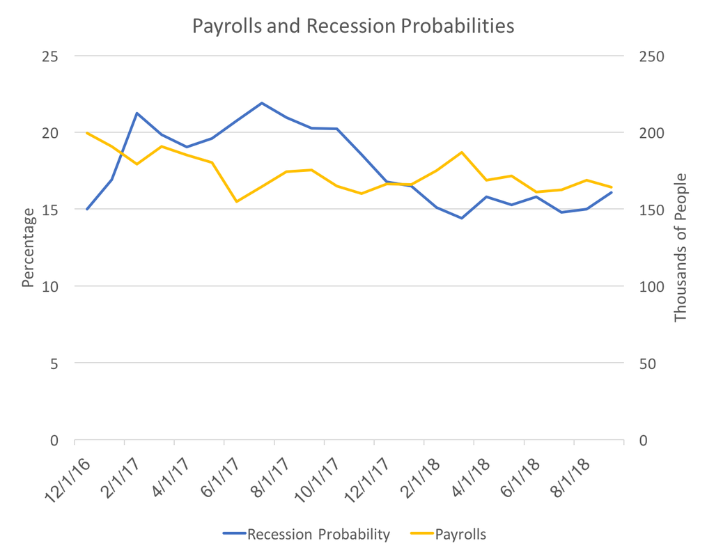
The next recession surely is on the horizon, some commentators a recession quickly approaching (usually citing the historically strong stock market) while most point to labor market slack and lack of inflation as signs the the recovery continues to progress. Forecasters, however, have signaled a turning point around the end of 2018, at least in terms of the unemployment rate: This v-shape has been well defined since the end of 2016, and while it may not perfectly correlate with the beginning of the next recession, it does provide some insight. Because we are rapidly approaching the close of 2017 there are two other variables that might give further indication of an impending recession, payrolls forecasts and recession probability: At this point, both of these year-ahead forecasts have been stable for the past few months. This past month the recession probability tick up quite a bit, and given the unemployment graph, one might expect it to continue to rise over the next six months. If the expected recession probability does start to increase and payrolls forecasts decline, that trough in unemployment will materialize around the beginning of 2019.
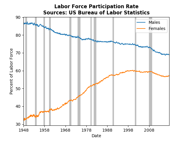
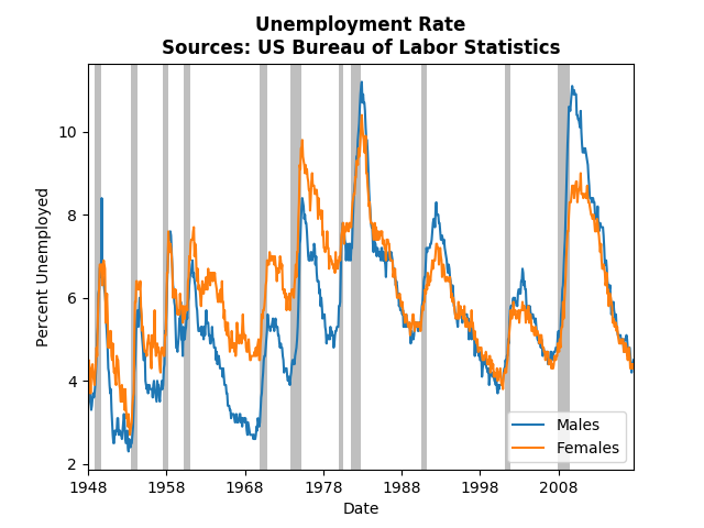
The dynamics in the labor market and higher education are remarkably different depending on whether we look at males or females. This post will highlight those differences and specifically look at how the dynamics differ by the type university (for-profit vs not-for-profit). First just to illustrate the different long run dynamics and their importance we quickly examine the labor force. Male labor force participation has steadily decreased since the WWII. While female labor force participation has leveled off since the 90's, female participation is recovering from the great recession, whereas males participation continues to decline. The story is even more incredible if one looks at the unemployment rate. Pre 1980, the female unemployment rate was consistently above the male unemployment rate. Since the 80's an unusual pattern has developed. Men face higher unemployment rates during and after a recession, but then eventually unemployment rates equalize. We have only observed four such occurrences, so it is unclear (at least to me) why that is the case. However, we know that many of the long-run changes in the labor market in the US has been the shift toward high-skill, college-educated, workers. Women have enrolled in college and universities at a higher rate than men for many years, which may be what is influencing the differences observed in the labor force and unemployment rate. To investigate this I used the IPEDS data service and collected data on 1574 colleges in 2001 and 2015. What struck me as interesting is how the different types of higher education institutions interact over the gender over time. The table below presents the enrollment rates of public, private not-for-profit, and private for-profit schools in 2001 and 2015. Not surprisingly enrollment rates have dropped for both men and women over that time frame. In addition, the not-for-profit institutions have lower enrollment rates than for-profit institutions. While public institutions do have higher enrollment rates than private not-for-profits, in 2001 both more or less treated men and women the same. However, in 2015 females have a lower enrollment rate than males. If we compare for-profit to not-for-profit, the for-profits have actually improved their "gender bias." Why might these numbers look this way? It's likely that these institutions are responding to the general call for attention to diversity. Since more women enroll in college, colleges must try to attract more men. In that case, we should look at the ratio of applications to enrollment: As mentioned, more females apply and enroll in not-for-profit colleges. However, in 2001 the application to enrollment ratio was very nearly 1, but that value dropped in 2015.This means that relative to the male to female ratios in the applications there were fewer females actually enrolling relative to the males at not-for-profit institutions. This suggests that women apply to more colleges than men.
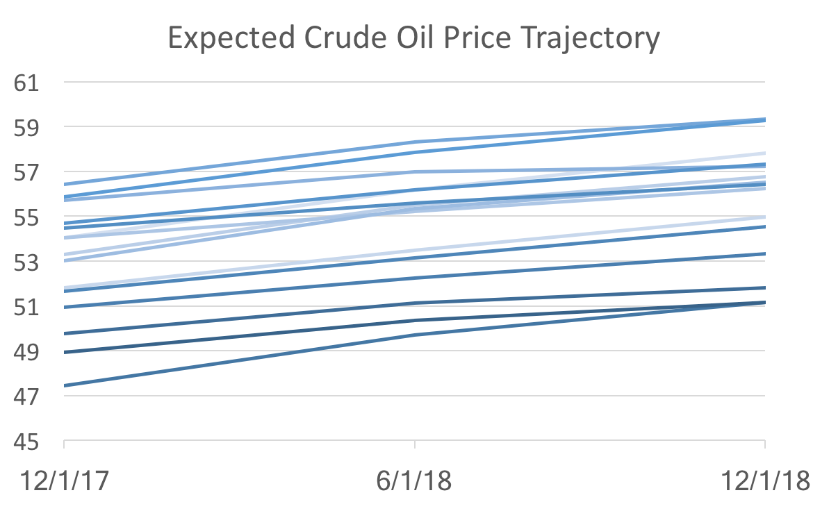
If instead we examine the for-profit schools we see the opposite dynamics. First, males were a higher percentage of the number of applications and enrollments (about 50% more in 2001!). But relatively speaking compared to the enrollment ratio, there were more females who should have enrolled in these for-profit institutions (about 5% more). That number improved from 2001 to 2015, but it still suggests that women are applying to more institutions then men. The final takeaway from this data: Women are applying to colleges at a higher rate then men, and that behavior has equalized across the types of colleges. That is, in 2001 men and women applied to the roughly same number of not-for-profit colleges, but more women applied to more for-profit colleges. In 2015, however, women applied to more colleges then men regardless of the type of college. Over that same time period it has become relatively easier for men to attend colleges. The new WSJ forecasts were released last Friday and it looks as if the recent data has caused the forecasters to be pessimistic about the short-term, but optimistic about the long-term. Forecasts for inflation and unemployment through 2018 worsened (unemployment ticked up, while inflation decreased), but consensus predictions for for both variables in 2019 improved. In addition, only the last two quarters of 2017 GDP growth were revised downward, and all subsequent quarters and annual projections rose. These general macroeconomic indicator forecasts were somewhat at odds with the changes in specific indicators like the ten-year bond rates and crude oil prices. Bond rates were all revised downward, despite increases of the expected federal funds rate in 2019. Crude oil prices are still expected to rise slowly over the next two years, but only reaching the low 52 dollar mark, instead of 53 or 54 from a couple of months ago. Despite the lackluster September employment report, payroll forecasts for next year rose by over 10,000 to 16,080. These numbers suggest that the recent data implies that the economy is sliding a little below the long-run growth path. As I pointed out while discussing the recent payroll report, long-run time-series dynamics seem to be dominating current forecasting (as opposed to structural modeling and forecasting). I believe these recent round of forecasts supports that idea, because this pattern of revision is consistent with the behavior we observe. To see what I mean look at Crude Oil Price forecasts: The graph above shows forecasts at different points in time (light to dark indicates old to new). All we see are level shifts (the intercept) holding the dynamics (the slope) the same. That suggest the new data are not changing anything about the fundamentals, which would alter the trajectory, but instead only reveal changes in the starting point of a more or less unchanged dynamic system.
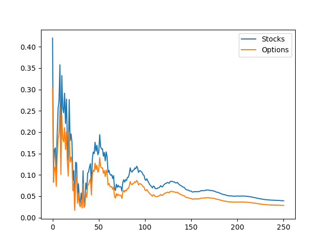
But is that good news or bad news? The good news: there really isn't any bad fundamental news. The bad news: models based on dynamic systems are correct on average, but since they are essentially data driven, it makes forecasters appear to be agreeing with each other. So the recent drop in forecast uncertainty (defined as the standard deviation amongst forecasters), does not necessarily indicate that we know a lot about where the economy is heading. A previous post analyzed the cycles in stock and options volume. This post seeks to expand on that topic using a different technique. While that previous post examined individual companies, this post will look at the markets as a whole. Using a dynamic factor model to extract a common factor between stock and option trading volume I find that the common factor is mostly driven by stocks. In addition the impulse response functions indicate periodic dampening. A dynamic factor model takes two or more series of data and considers whether there are some common, unobserved forces (the factors) that influences those variables. For instance, in this stock and options exercise that common factor might be market enthusiasm. Since we don't observe the factor we can't actually give it a name. Dynamic factor models generate results that tell us how correlated the factor is with each variable and how much each variable contributed to determining the factor. I will use the NYSE trade volume data, and the VBOE options data, which are daily volume statistics from November 1, 2006 on. I find that the factor loadings (correlation of the variables with the underlying factor) are 0.42 and 0.30 for stocks and options, respectively. The coefficients of determination (the degree to which each variable contributed to the factor) are 0.99 for stocks and 0.19 for options. These numbers tell us that this unobserved factor can explain about a third of the growth rates for trade volume in stock and options markets. Further, stock market trade volume is the primary driver of the common force that drives these markets. Finally, we look to the impulse response function: An impulse response function is a graph of what happens to the variables of interest if there is a one time shock (increase or decrease of the variable). That is, suppose the factor increases by 1% today, and impulse response function test us the impact of that 1 percent growth have on the subsequent days of trading. A critical component of this is that there are no additional shocks on the subsequent days. For our data, you can see that the first period has an increase equal to the factor loading, if the factor goes up by 1, stock volume goes up by 0.42 etc.
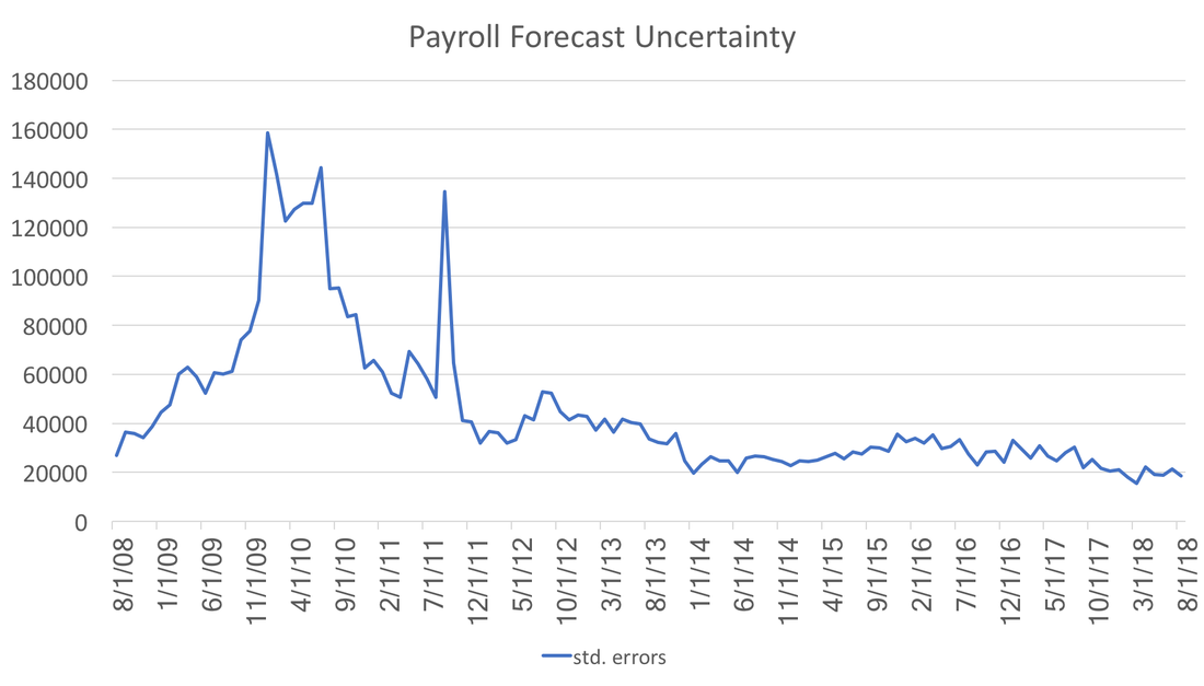
The surprising part of this graph is the periodic dampening effect. This leads me to believe that the factor is measuring some sort of herd behavior or enthusiasm cycle (Keynes' "animal spirits" comes to mind). When there is a spike in trading, participants back off to assess the situation, as that happens, the market starts to look more attractive so they pile back in, leading to another (smaller) spike and so on. The numbers are in: huge revisions to the previous two months, and a meh of an initial estimate. Most analyses of this payroll report mention Hurricane Harvey and the potential impacts, which likely may have an influence in subsequent payroll updates. However, the greater concern should be how uncertainty about the future job market conditions influence the economy. The graph below shows the history of payroll forecast standard errors in the WSJ economic forecasts. Not surprisingly uncertainty peaked during the recession, but the gradual decline, observed over the past two years, should be welcome news. The lower uncertainty is also striking given the volatile news/political cycle we have been in for the past 6 months. A decrease in forecast uncertainty suggests that markets are comfortable with the direction of the economy. The forecast uncertainty during the recession was not because it was a recession, but rather that everyone was unprepared for its arrival and severity. Therefore, suggesting that low forecast uncertainty means a strong economy may not be wise.
Like much of the actual data coming in, forecasts are tepid. Essentially, forecasts are converging to their long-run means (or moving averages) because there is not enough information in the incoming data to give clear signals. Different models stress different variables, which is what typically gives the forecast uncertainty we saw during the recession. However, the general consensus we now observe implies that most forecasts are emphasizing the basic time-series aspects of the data. |
Archives
May 2018
Categories
All
|

 RSS Feed
