RSS Feed
|
The new WSJ forecasts were released last Friday and it looks as if the recent data has caused the forecasters to be pessimistic about the short-term, but optimistic about the long-term. Forecasts for inflation and unemployment through 2018 worsened (unemployment ticked up, while inflation decreased), but consensus predictions for for both variables in 2019 improved. In addition, only the last two quarters of 2017 GDP growth were revised downward, and all subsequent quarters and annual projections rose. These general macroeconomic indicator forecasts were somewhat at odds with the changes in specific indicators like the ten-year bond rates and crude oil prices. Bond rates were all revised downward, despite increases of the expected federal funds rate in 2019. Crude oil prices are still expected to rise slowly over the next two years, but only reaching the low 52 dollar mark, instead of 53 or 54 from a couple of months ago. Despite the lackluster September employment report, payroll forecasts for next year rose by over 10,000 to 16,080. These numbers suggest that the recent data implies that the economy is sliding a little below the long-run growth path. As I pointed out while discussing the recent payroll report, long-run time-series dynamics seem to be dominating current forecasting (as opposed to structural modeling and forecasting). I believe these recent round of forecasts supports that idea, because this pattern of revision is consistent with the behavior we observe. To see what I mean look at Crude Oil Price forecasts: 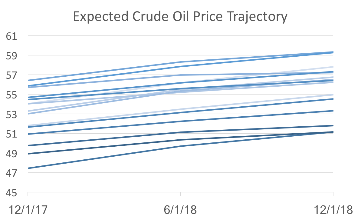 The graph above shows forecasts at different points in time (light to dark indicates old to new). All we see are level shifts (the intercept) holding the dynamics (the slope) the same. That suggest the new data are not changing anything about the fundamentals, which would alter the trajectory, but instead only reveal changes in the starting point of a more or less unchanged dynamic system.
But is that good news or bad news? The good news: there really isn't any bad fundamental news. The bad news: models based on dynamic systems are correct on average, but since they are essentially data driven, it makes forecasters appear to be agreeing with each other. So the recent drop in forecast uncertainty (defined as the standard deviation amongst forecasters), does not necessarily indicate that we know a lot about where the economy is heading.
0 Comments
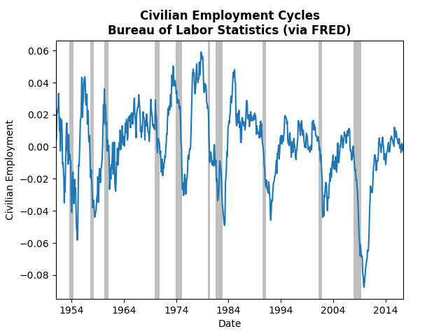
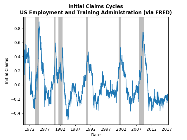
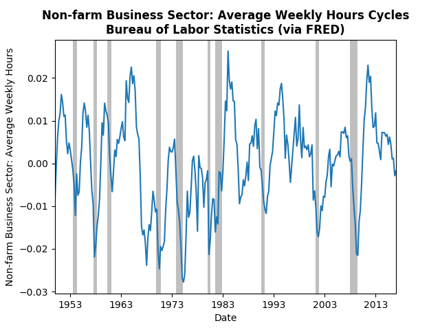
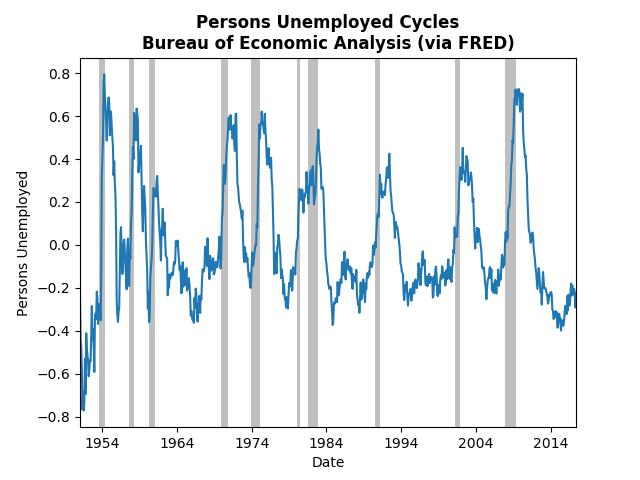
Following up on Monday's post about the employment report, today's post will look at the most recent employment data using Hamilton's filtering method. The commenters on the Federal Reserve (see Tim Duy or Narayana Kocherlakota) have noted the uncertainty surrounding employment and inflation. Kocherlakota specifically sees weakness in employment and downplays inflation worries. Tim Duy is less prescriptive, but also notes the uncertainty. The graphs below demonstrate where this uncertainty is coming from. Employment and weekly hours appear to be at their trend, or falling slightly below (not good), but initial jobless claims and unemployment are well below their trend (good). The most telling sign is the continued drop off in weekly hours, which could mean that employers have worked through the "slack" in the economy. The graph of real wages below corroborates that story: 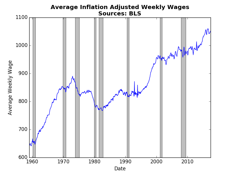 From 2013-2015 real wages finally started to rise as weekly hours fell and the job market tightened. However, recent wage reports have indicated a return to stagnant real wages (meaning wages are only just keeping up with inflation). Real wages climb when employees have bargaining power, which happens when fewer qualified people apply for the same jobs. Despite a healthy June jobs report, the likelihood of sustained jobs growth seems to be dimming with each month.
Bill McBride at Calculated Risk, commented on the strength of the recent employment report. Indeed, the news was much rosier than expected. Tim Duy's Fed Watch agreed with market expectations of approximately 170,000 jobs. The WSJ Economic Forecasters expectations were slightly lower at 165,000 and they have typically underestimated payroll employment: 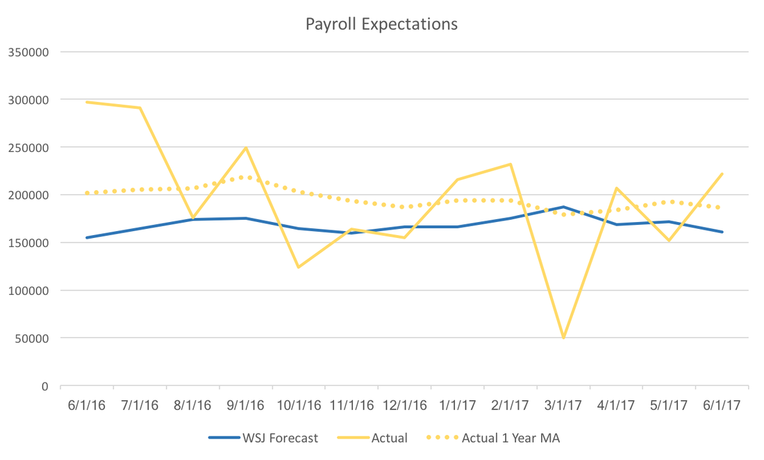 However, the graph above and the graph below hint at the Federal Reserve's continuing conundrum. Payroll employment seems to be consistently beating expectations, but inflation is lower than expected. The WSJ Forecast below is for June 2017 year over year inflation, and the trajectory of actual inflation it seems unlikely that we will break the Fed's two percent target. 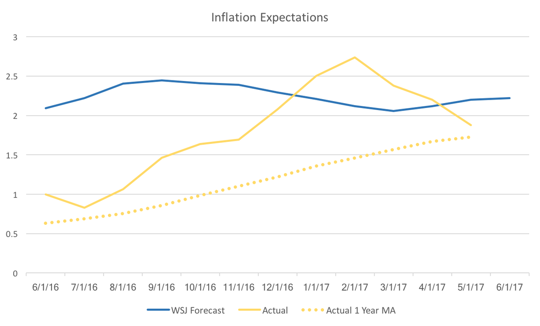 The upcoming release of the July WSJ Economic Forecasts may provide more insight to where market participants think the Fed is heading. It is likely that the jobs report will boost both GDP and fed forecasts, but that relies on forecasters optimistic outlook on inflation.
Today we take another look at the WSJ Economic Forecast Survey. This time we focus on non-farm payrolls. In some sense, non-farm payrolls provide a more accurate picture of the labor market than looking at headline unemployment. Typically we look at the change in non-farm payrolls. The graph below presents actual non-farm payrolls (in yellow) and the consensus forecast (in blue). 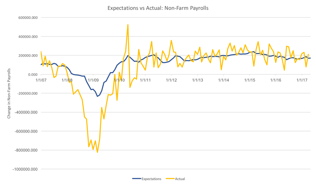 In general, the forecasters have been more or less on the trend over the past few years, however, they severely underestimated the Great Recession. In fact, the worst any individual thought job losses would be was 400,000, whereas job losses actually reached 750 thousand per month. While forecasters do seem to do well with the overall trend, they do not capture anything close to the month to month variation seen in the realized data.
Payrolls data suffer from major revisions. It is unclear whether forecasters are targeting initial estimates, or revised estimates, however, the picture above would be qualitatively unchanged. In the face of this much volatility it also makes sense for forecasters to focus on the trend rather than the noise. This strategy has served survey participants well, except for the recession. For now, it is unclear why forecasters were systematically over-optimitisic during the great recession. |
Archives
May 2018
Categories
All
|