RSS Feed
|
The BLS recently released the new CPI and inflation statistics. This signals a weakening economy along the lines of Tim Duy's analysis. As Mark Thoma points out, the Fed does not have a lot room to defend the economy against a recession, and congress seems incapable of doing anything at the moment. The WSJ Economic Forecasters expectations indicate further trouble, since they are above actual inflation, but are dropping: 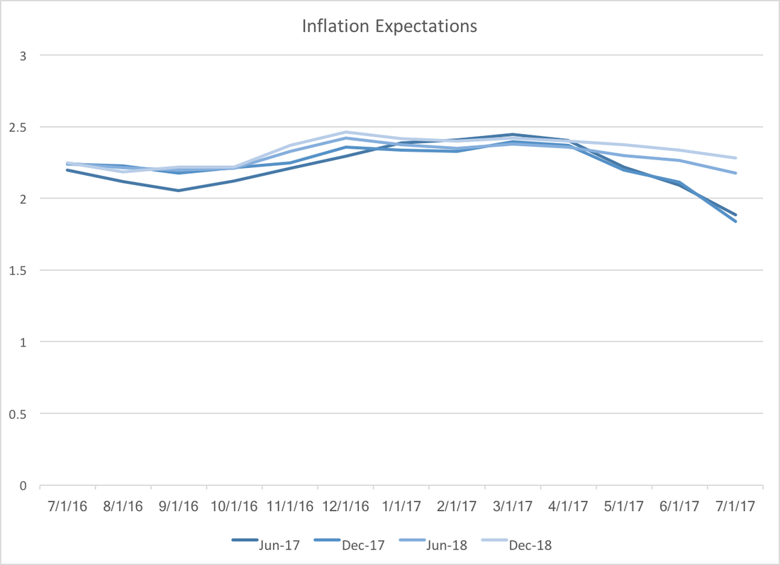 If lower inflation expectations exist in the rest of the economy we can expect slower growth in the coming months. Lower inflation expectations usually are a self fulfilling prophecy, since workers, firms, and households make decisions that reinforce the low inflation future. For example, firms might anticipate lower revenues and therefore lower prices in order to drive up sales.
How do these lower inflation expectations fit into the larger long term picture? Well, the same analysts forecast GDP growth at 2.38 and 1.94 in the 2018 and 2019, respectively. In addition, my previous post on Fed funds rate expectations uncertainty indicates that Federal Reserve credibility (at least in terms of future interest rates) has improved. Inflation expectations for 2017 are low, but expectations for 2018 and 2019 are both firmly above 2 percent. This suggests that analysts believe the economy will slow down in the next two years and that the Fed will take appropriate measures (with what little room they will have) to fend off or minimize a recession.
0 Comments
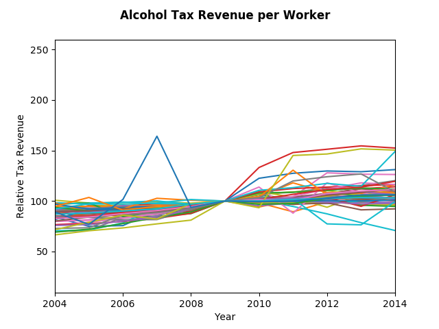
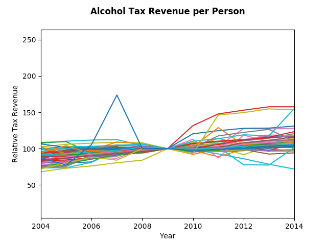
Endogeneity, or the chicken and the egg problem. Previously addressed in a post on Housing Prices in the US, this time we exam alcohol. Do we drink more during and after and recession because we are depressed? Or does the fall in income curtail our ability to purchase alcohol? Coming into this analysis, it seemed likely that the former was true, turns out, the latter seems to be true during the great recession. The state level data collected comes from the Tax Policy Center and GeoFred. Surprisingly alcohol tax revenue per person has been increasing by about 2 percent per year, more or less keeping up with inflation. The graphs below show relative changes in Alcohol Tax Revenue per Person and per Worker in all 50 states (and DC), with a base year of 2009. While there are certainly a few states that saw large increase post recession, it is unclear whether we are observing increasing or decreasing growth rates. To address that question we can calculate average growth for each state in the five years prior to 2009 and and the five years after. Calculating the difference of the average we find that growth of alcohol tax revenue per person declined by 0.35 percentage points while per worker it declined by 1.59 percentage points. If instead we choose 2007 as the mid point, so that the 18 months of the recession are part of the post period, the numbers for per person and per worker are a 1.46 percentage point decline and a 0.11 percentage point increase, respectively. Those results suggest that it's likely that the income effect dominates the "feeling depressed" effect.
Naturally with a rough analysis like this there are some caveats. Tax revenue is not the same as consumption, but I suspect they are highly correlated, particularly when the tax laws have not changed. To really be sure of this result one would need to control for increases (and decreases) in alcohol sales tax rates. In addition, the recession hit states disproportionately. A more proper analysis would take that into account. Finally, this analysis also lacks a way to control for substitution effects, that is, a switch from expensive to cheap alcohol. The WSJ economic forecasting survey published mostly good news. Surprisingly, the positive jobs report did little to change forecasts of payroll employment, however it has lowered expectations of a federal funds rate hike by December:  Most of the consensus revisions saw improvements over the next six months to a year, most notably with the probability of a recession dropping by almost one percentage point to 14.77 percent. The consensus also revised oil prices in December down by almost 3.5 dollars to 47.44. Though predicted GDP growth for the year increased slightly, predictions for Q2 fell by 0.2 percentage points to 2.72 percent. The table below summarizes the changes in forecasts for some key variables. 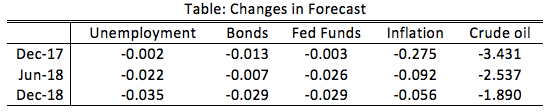 Inflation revisions seem correlated with significant drops in crude oil prices, however the unemployment revisions seem at odds with the federal funds rate revisions. If unemployment is expected to be better, forecasters should be predicting increasing federal funds rates. Perhaps they believe that their lower inflation forecasts imply a more accommodating stance from the Fed.
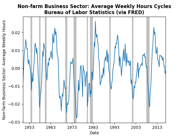
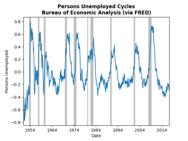
Following up on Monday's post about the employment report, today's post will look at the most recent employment data using Hamilton's filtering method. The commenters on the Federal Reserve (see Tim Duy or Narayana Kocherlakota) have noted the uncertainty surrounding employment and inflation. Kocherlakota specifically sees weakness in employment and downplays inflation worries. Tim Duy is less prescriptive, but also notes the uncertainty. The graphs below demonstrate where this uncertainty is coming from. Employment and weekly hours appear to be at their trend, or falling slightly below (not good), but initial jobless claims and unemployment are well below their trend (good). The most telling sign is the continued drop off in weekly hours, which could mean that employers have worked through the "slack" in the economy. The graph of real wages below corroborates that story: 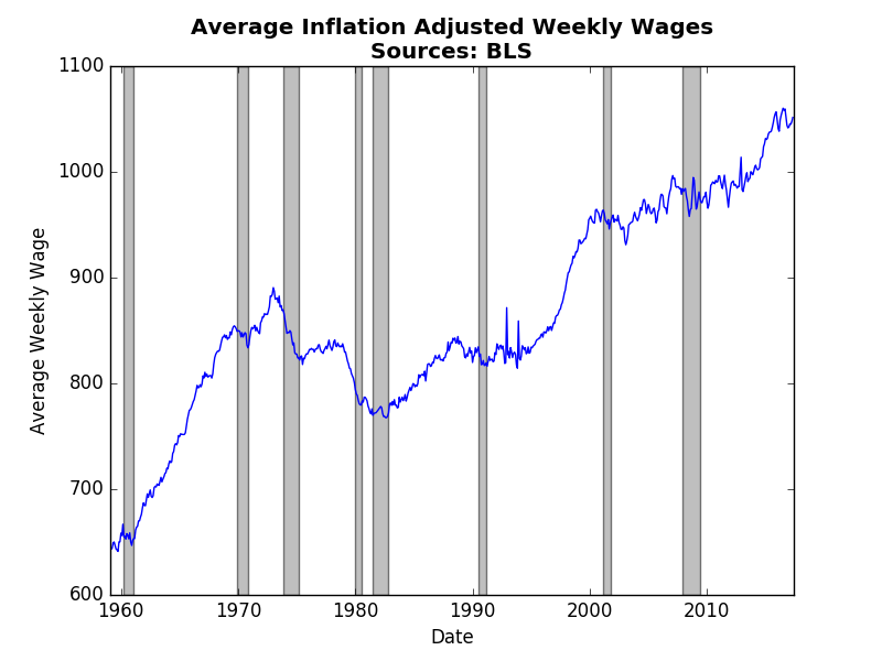 From 2013-2015 real wages finally started to rise as weekly hours fell and the job market tightened. However, recent wage reports have indicated a return to stagnant real wages (meaning wages are only just keeping up with inflation). Real wages climb when employees have bargaining power, which happens when fewer qualified people apply for the same jobs. Despite a healthy June jobs report, the likelihood of sustained jobs growth seems to be dimming with each month.
Bill McBride at Calculated Risk, commented on the strength of the recent employment report. Indeed, the news was much rosier than expected. Tim Duy's Fed Watch agreed with market expectations of approximately 170,000 jobs. The WSJ Economic Forecasters expectations were slightly lower at 165,000 and they have typically underestimated payroll employment: 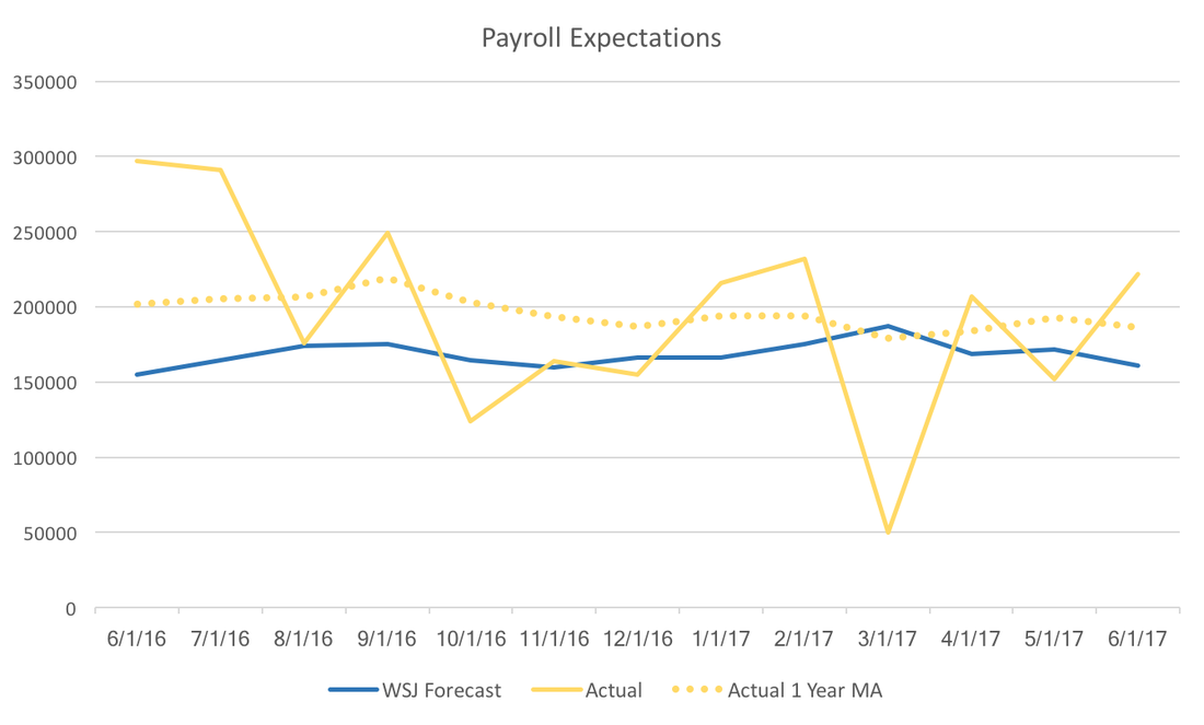 However, the graph above and the graph below hint at the Federal Reserve's continuing conundrum. Payroll employment seems to be consistently beating expectations, but inflation is lower than expected. The WSJ Forecast below is for June 2017 year over year inflation, and the trajectory of actual inflation it seems unlikely that we will break the Fed's two percent target. 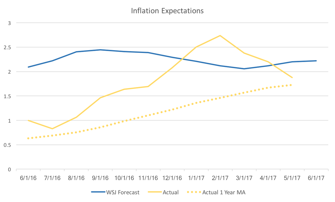 The upcoming release of the July WSJ Economic Forecasts may provide more insight to where market participants think the Fed is heading. It is likely that the jobs report will boost both GDP and fed forecasts, but that relies on forecasters optimistic outlook on inflation.
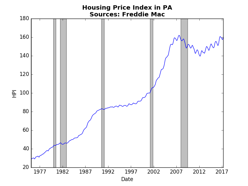
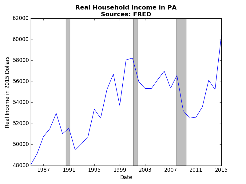
Housing prices in the US have crossed their pre-recession levels as shown in the graph below. Housing prices, much like many economic variables, tend to have an upward trend, usually exhibiting compound growth. This post uses state-level data on real household income and housing prices to explore the concept of endogeneity, or the chicken and the egg problem. 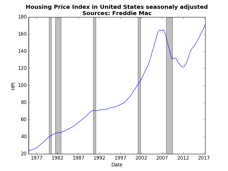 In economics, we frequently need to disentangle a vicious (virtuous) cycle. An example of a vicious cycle, a poor people tend to be the ones who purchase lottery tickets, which comes first: being poor or buying lottery tickets. This type of story exists in house prices and income in Pennsylvania depicted in the graphs below. Though real household income displays more volatility (the HPI is monthly and not seasonly adjusted) the general trends are more or less the same. What we might want to know is whether housing prices impact real incomes or the other way around. Clearly as people earn more income they can afford to purchase a house. However, as we saw during in the lead up to the great recession as housing prices start to soar, more individuals receive income from real-estate, either through sales, rentals, or "flipping." Macroeconomists utilize the irreversibility of time as a way to control or mitigate endogeneity. Something that happens today surely cannot impact what happened yesterday. After converting the state-level data into annual growth rates we can evaluate how lags (old values) of data impact current values. The table below reports those results. 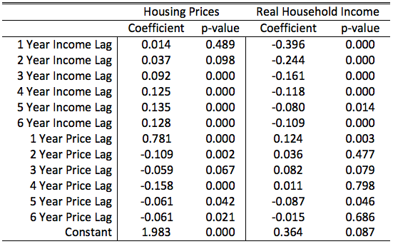 In these tables we see an interesting pattern. First, and not surprisingly, the lag of the dependent variables are all significant. Past performance influences future performance. Real household income exhibits a significant but weak negative response to the past. If last year was a good year this year is likely to be a little worse. In contrast, housing prices exhibit positive response to the past. If last years housing prices grew by the same amount as the previous four you can count on a year that is at least as good if not better.
The more important results are the off-lags, or how past prices influence income and vice versa. For housing prices, we see a relationship that is not too surprising. A build up of positive real income over distant past will lead to an increase in house prices. Intuitively, several years in a row of positive income growth leads to higher demand for houses, which drives up prices. The impact of housing prices on income is less clear. A rise in last years prices increases income (and maybe even the 3 year lag as well), which makes sense, since as price start to increase we can expect more sellers to join in. However, the 5 year lag is puzzling. I suspect that this is an artifact of the great recession. What we found was that both stories have some truth to them. It seems that the strength and duration of the impact of income on prices seems more and longer than that of prices on income. Therefore, it seems more likely that the recent increases in housing prices are in response to increased real incomes rather than housing prices predicting future real income increases. Technical notes: both regression included fixed effects by state. Data was from 1986 to 2015 for all fifty states and DC. WSJ Economic Forecast participants report the probability of a recession within the next 12 months. The consensus of the June survey participants has that probability at 16 percent. It appears that Q3 GDP growth appears to play a critical role in forecasters recession probabilities. The table below reports the results of a simple regression. 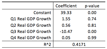 A forecaster who predict zero GDP growth in Q3 would place, on average, a 40 percent probability on the chance of a recession in the next 12 months. For every one percent increase in predicted Q3 GDP growth, that average recession probability would decrease by 10 percentage points. The other quarters do not appear to have a statistical relationship with recession probabilities.
Taken altogether, while a recession does not appear likely to these forecasters, the third quarter plays a pivotal role in these forecasts. The current consensus is 2.6% growth in the third quarter, only slightly below Q2 expectations. If we see weakness leading into the third quarter, we can expect forecasters to start increasing the probability of a recession. Colleges have become increasingly expensive. College graduates are leaving college with more and more debt, yet everyone says that you need to get a degree. As the costs get higher, it no longer becomes clear whether that declaration still holds (see here and here). It makes sense then that sites like Payscale try to give consumers more information about their choices. Payscale provides a report once a year on the average annual salary of several schools (over 900 institutions). The table below lists the top 10 schools in 2016-2017 at the Early and Mid-Career levels. 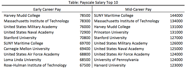 They are mostly elite colleges that only admit the top students, therefore, it isn't surprising that the receive high salaries. Also many of these universities are known for engineering. Thankfully, Payscale also provides the average salary for many college majors (over 300). Using this data and the IPEDS database we can reconstruct what colleges and universities average salary should have been had their graduates earned the average salaries for the degrees they earned. Using this constructed salary we can create a "mark-up" value. The two graph below show the top 10 Early and Mid-Career mark-ups. 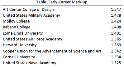 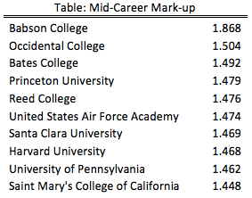 What a difference. There are still a few elite colleges and universities, but there are several surprising names amongst these lists. However, we still are forced to admit that the quality of the graduating students certainly reflects the quality of the entering students. So do these mark-ups reflect what students are getting out of their experience in school, or do the numbers just reflect the ability they brought with them. To address that the following table subtracts the early-career mark-up from the mid-career mark-up. If the number is large then it is likely that something about their college experience is being recognized as valuable by the job market. 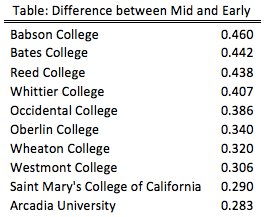 This top 10 is very different than the previous lists. This is a clear victory for small liberal arts colleges and their ability to transform lives. However, Babson College certainly deserve special recognition for being on all three top 10 lists. This analysis does not tell you which college to go to since it does not incorporate the costs. However, it does tell you which colleges provide an education that employers learn to value.
If you're interested in a particular college or university please leave a comment or send me an email. Over the past year there has been less disagreement across forecasters predicting the Federal Funds Rate, and unemployment. Not surprisingly as the forecast horizon (the time between the forecast and it's realization) decreases the agreement among forecasters increases. That is, there are fewer outliers because more is known. The WSJ Economic Forecasts display this property, however, using the payrolls employment forecasts we can isolate the changes additional variation outside of the monthly uncertainty. The graph below plots the normalized standard deviations for Employment Payrolls, Inflation, Federal Funds Rate, and Unemployment forecasts. 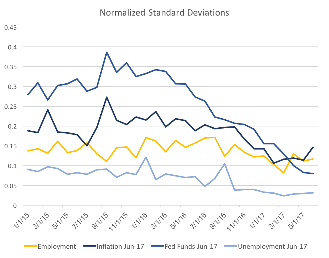 The yellow line of employment payrolls is stable, with a slight decrease in the past half year. In contrast, the Fed Funds Rate exhibits a very steep decline from a year ago. This is likely due to increased consistent messaging amongst FOMC participants as well as improved (and consistent) fundamentals. A large portion of the decrease is likely just due to the shortened horizon. The following graphs will display the forecast variability over all the forecast horizons. 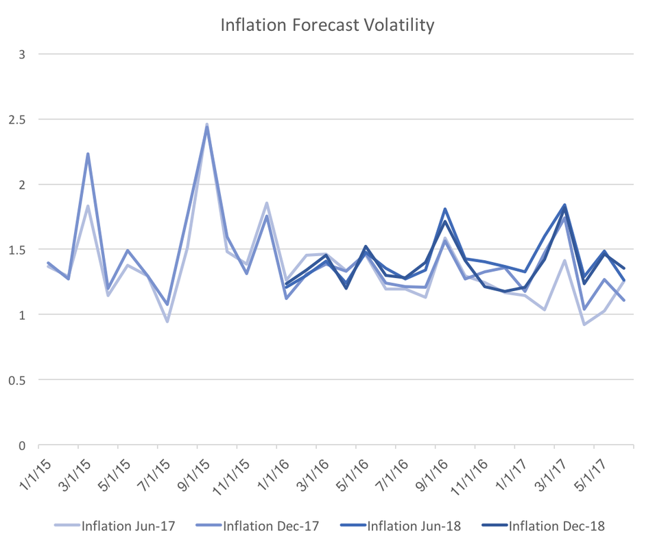 The graph above shows the four forecasts of inflation. Clearly once we control for the general uncertainty the slight downward trend of inflation forecast variability disappears. However, the graph below shows that that the downward trend very strong for the Federal funds rate forecast variability. 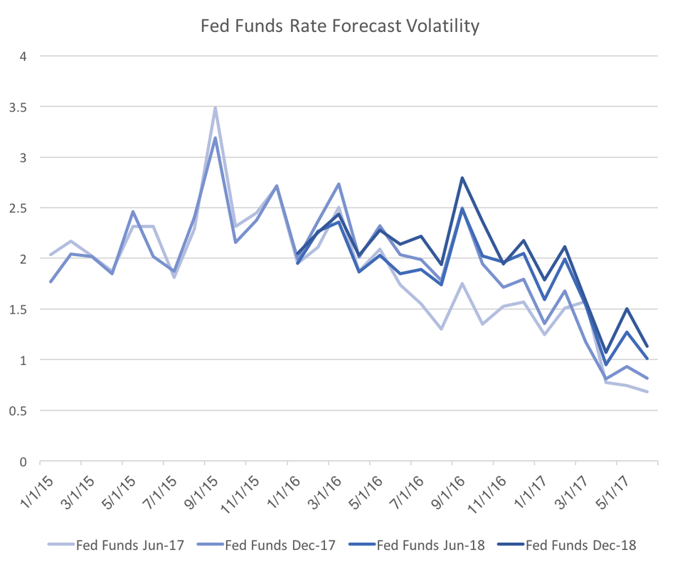 Also note that the drop is across all four forecasted dates, which implies that the result is not a normal change over forecasting horizons. Fed officials should be encouraged by this graph because it suggests the consistent messaging may be consolidating interest rate forecasts. 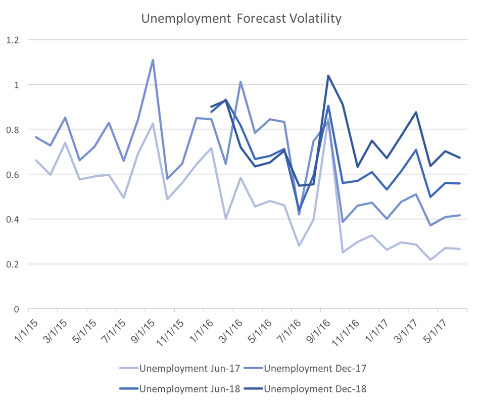 We see a similar, but slightly different graph for unemployment. Again it looks as though all four forecasted dates are decreasing in forecast variability. The main difference is that there is clear stratification across forecast horizons. From this graph it is unclear whether forecasters truly are more certain, however, I suspect the clear stratification across forecast dates indicates a typical spread of forecast horizon uncertainty.
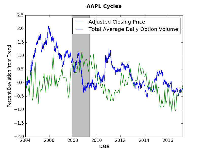
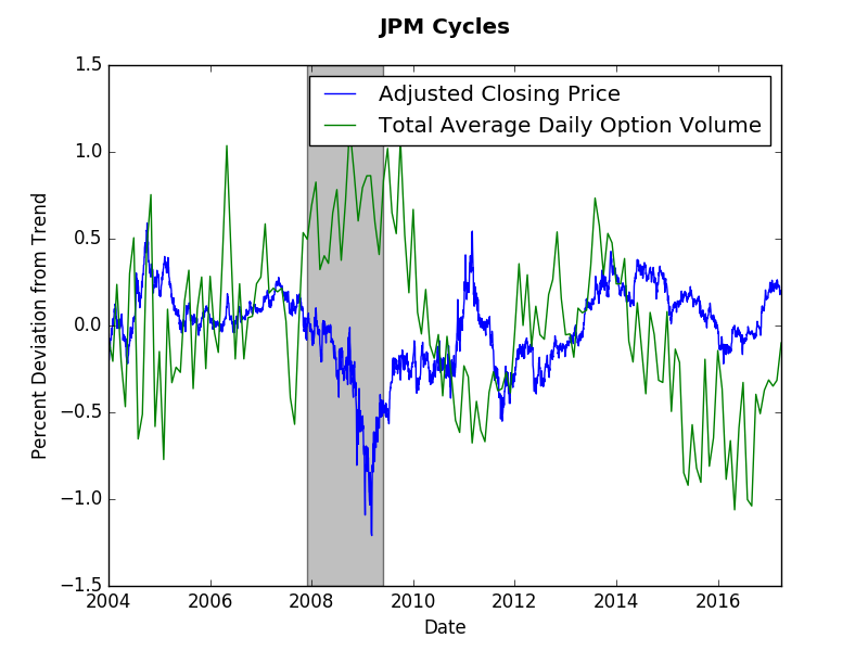
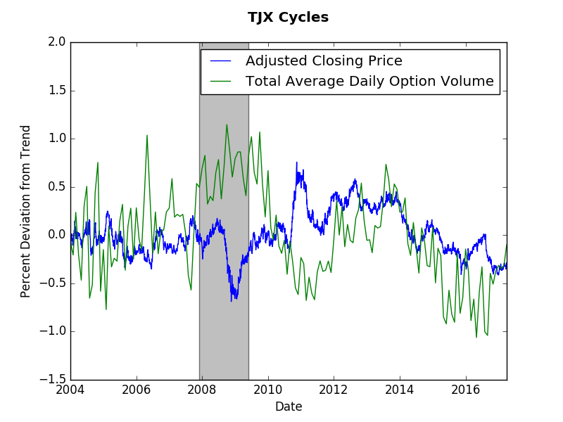
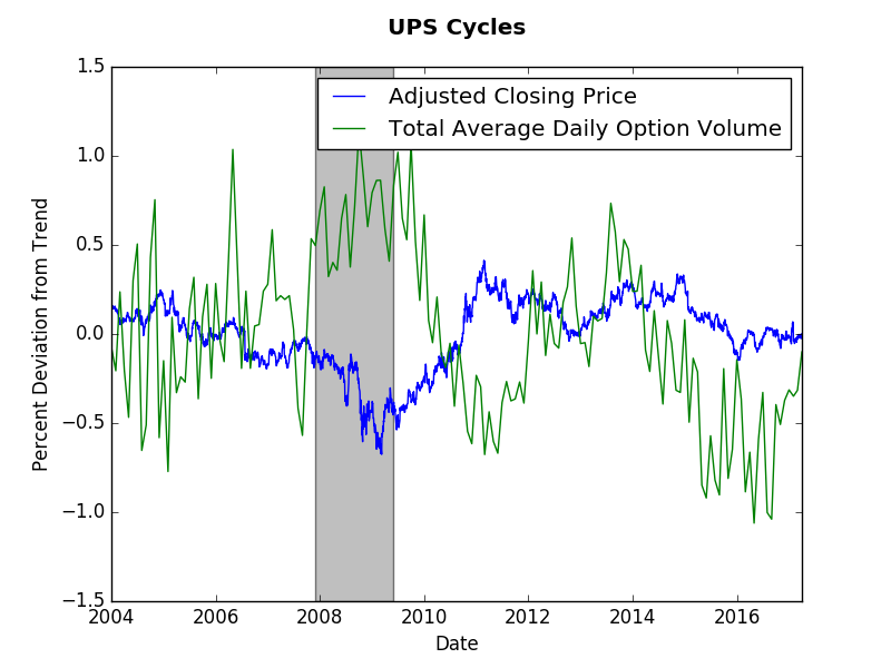
The short answer? No. The long answer will probably need to wait for a detailed academic paper. However, this post will present some suggestive evidence that the short answer above is correct. We will look at end of day price data (obtained via wiki EOD) and monthly options volume data (obtained from the CBOE). As usual, the Hamilton cycle method provides my preferred measure. This post shows that options volume tend to have longer cycles than stock prices. Our evidence will come from four stocks: Apple (AAPL), JP Morgan (JPM), TJ Maxx (TJX), and UPS. As you observe the graphs consider a cycle to be several months away from trend (zero). The graphs below present those cycles. Options and stock price do not appear to exhibit any synchronicity. Options cycles seem the same across these stocks despite them coming from different sectors of the economy. The only consistent fact is increased options volume and a decrease in stock price during the Great Recession. Options volume appears more jagged, which makes it harder to assess the cycles. However, if we were to look at stock volume we would find even more volatility.
To answer the question at hand let us just count the number of deviations from trend for each company. For Apple, 5 option cycles and 6 price cycles. For JP Morgan, 5 option cycles and 7 price cycles. for TJ Maxx, 5-6 option cycles and 7-8 price cycles. Finally, for UPS, 5 option cycles and 5 price cycles. This by no means is a statistical test, however, it does suggest that over the same time period there were fewer options cycles than price cycles. One can think of the option cycle as the force of speculation on the future stock price, whereas the current stock price cycle reflects more frequent news about firm value. Perhaps the lack of options trades (relative to stock trades) slows down the formal speculative market. When this post idea came to me, I expected a stronger correlation between prices and options. The lack of correlation true (more or less) when comparing stock volumes (the graphs were messier though). Any thoughts? Please comment below... If you would like to have a similar graph of a specific company let me know. |
Archives
May 2018
Categories
All
|